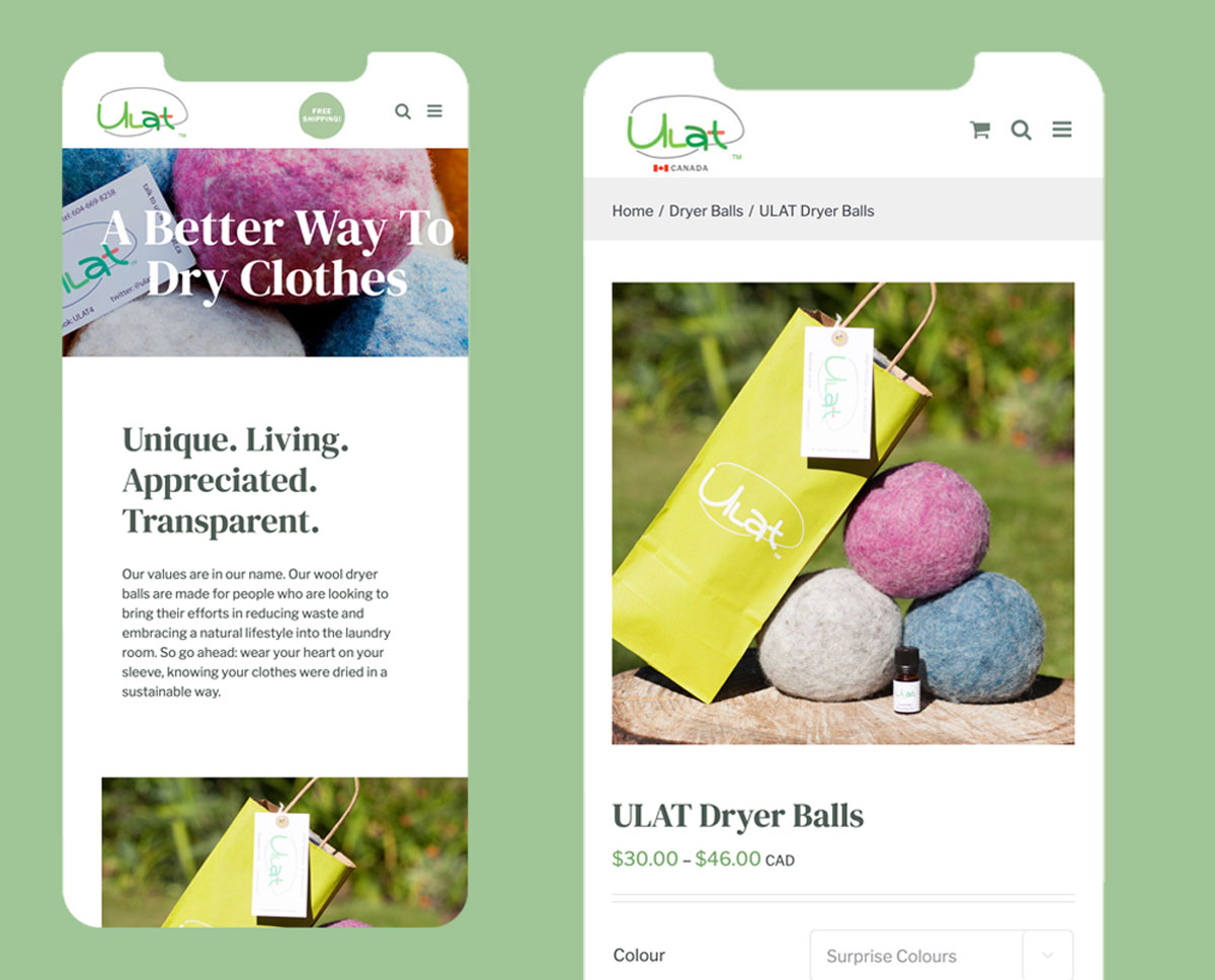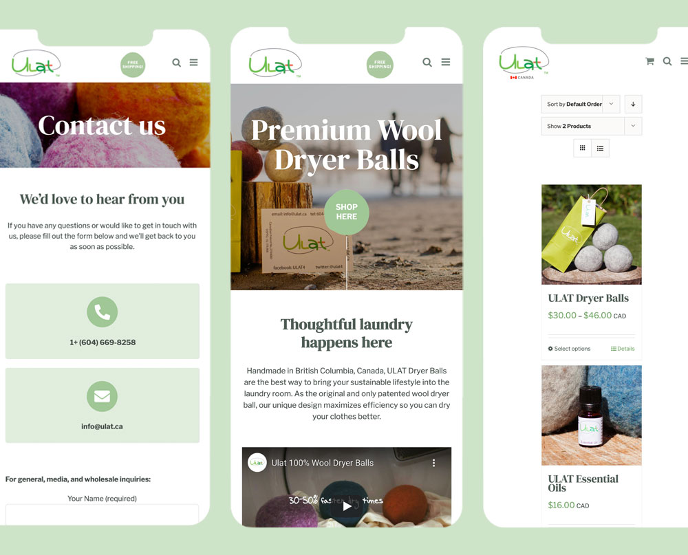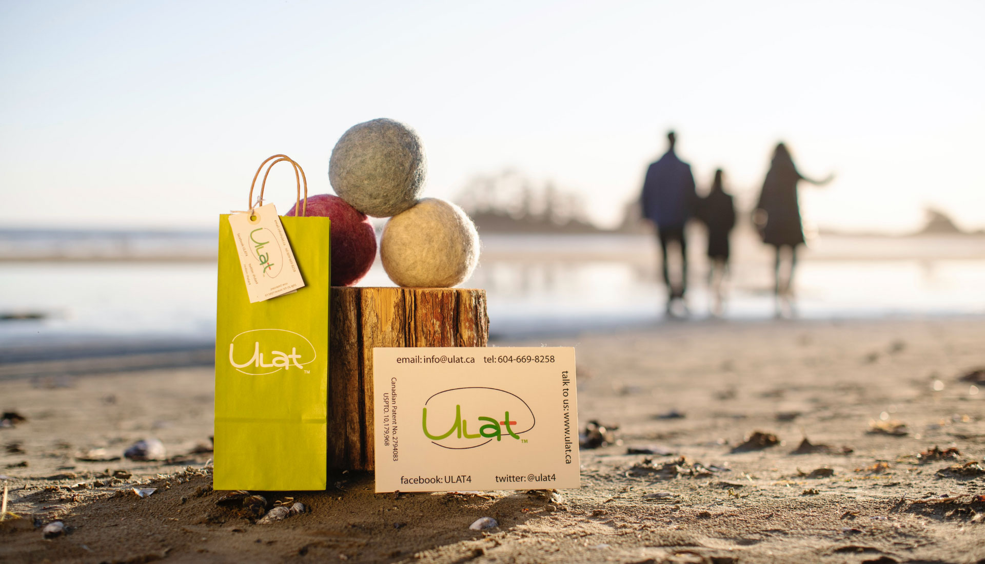
ULAT is a British Columbia company that dedicates themselves to produce handmade laundry Dryer Balls that are sustainable for the environment. The objective of this project was to design and develop a new corporate website that included an online store for ULAT’s Canadian, US, and international audiences.
THE PROCESS
Client Discovery
User and Market Research
Concept Design
Customer Journey, User Personas, Site Architecture
Concept Development
High Fidelity Prototypes
Development
Evaluate
Launch
DISCOVERY
What is the goal?
The main goal of the website was for users to purchase the company’s products. The second goal (but almost as important) was for the website to instruct users on ULAT’s brand and values.
What are the main challenges/opportunities?
The main challenge – and opportunity – that we have to tackle through this project, was the creation of three separate online stores that still looked, and felt similar in terms of branding. The decision on creating three separate stores was based on the fact that ULAT’s major audiences (Canada, US, Japan, and Europe in the coming future) had different needs in terms of content, currency, and financial requirements (taxes, etc).
What does success looks like?
Increased number of sales across the website.
Who is the audience?
Sustainability-conscious people, across Canada and the United States.
USER PERSONA
Martha
Background:
Martha’s interests are many and vary in nature. She is 42 years-old, an Accountant, a mother of 2, and is happily married. Martha has always been attracted to environmental issues, and she is very intentional about purchasing sustainable products, especially now that she has a family to keep in mind.
She enjoys an active and healthy lifestyle and embraces minimalism, life/work balance, and eco-friendliness as some of her deepest values.
Martha also enjoys the finer things in life. She knows that it is much better to purchase an item of quality that is ethically sourced and good for the environment, even if it comes with a higher price tag.

CONCEPT DESIGN
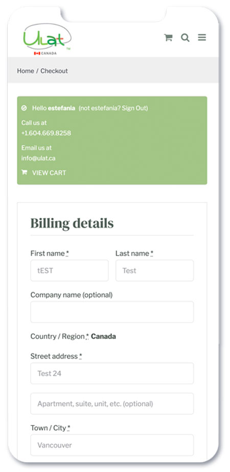
One of the most important parts of the project was to create a seamless checkout process, in order to encourage customers to buy the product. For this instance, we decided to go with WooCommerce given its compatibility with WordPress and the ability to be customized to suit the users’ needs.
In terms of branding, it was important that the website reflect Ulat’s value for simplicity, minimalism, and ethical responsibility. To achieve this, I kept the website design simple with a minimalistic look while focusing as much as possible on the product.
INFORMATION ARCHITECTURE
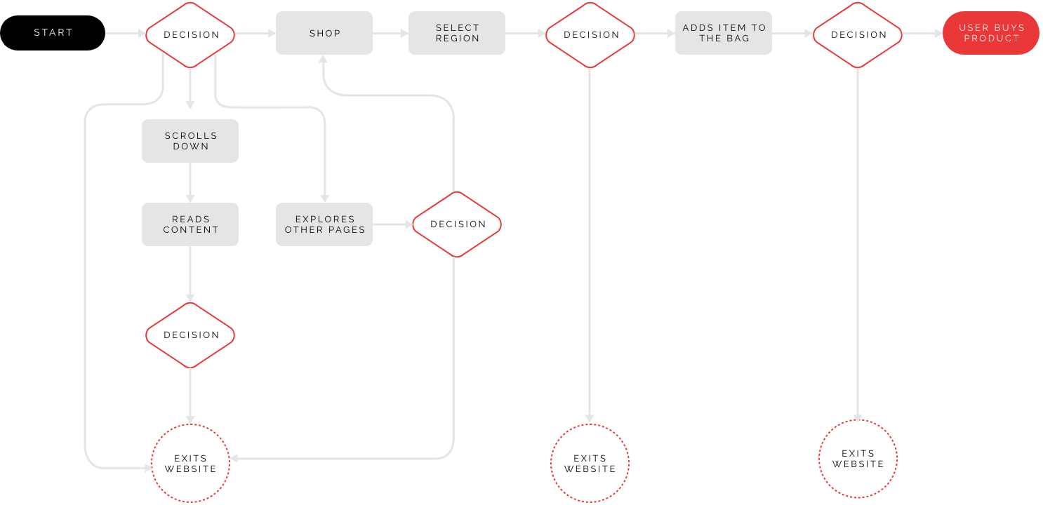
From a UX perspective, the most important goal was to facilitate sales. To accomplish this I was inspired by Donald Miller’s Building a Story Brand to strategically place content and call-to-actions to inspire clients to purchase the product.
USERFLOW
SITEMAP

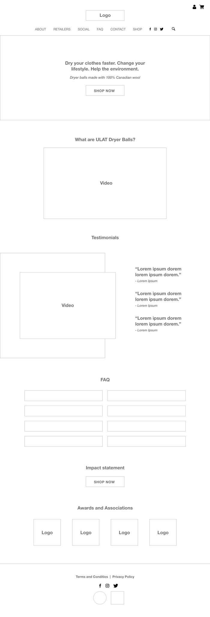
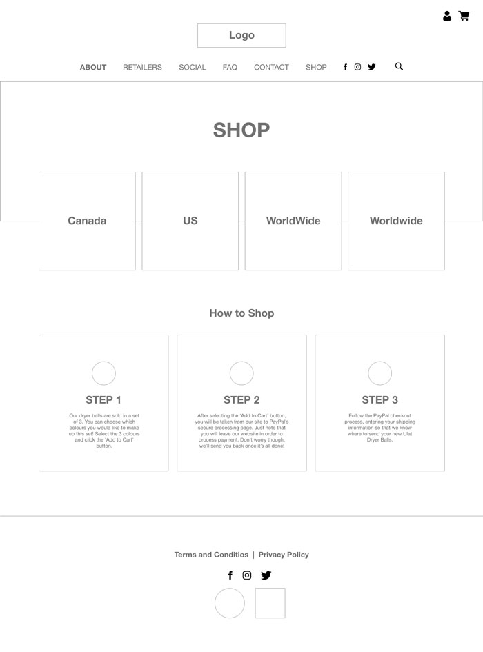
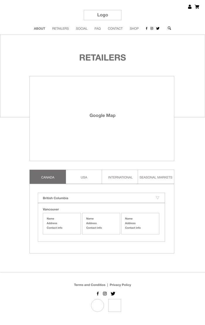
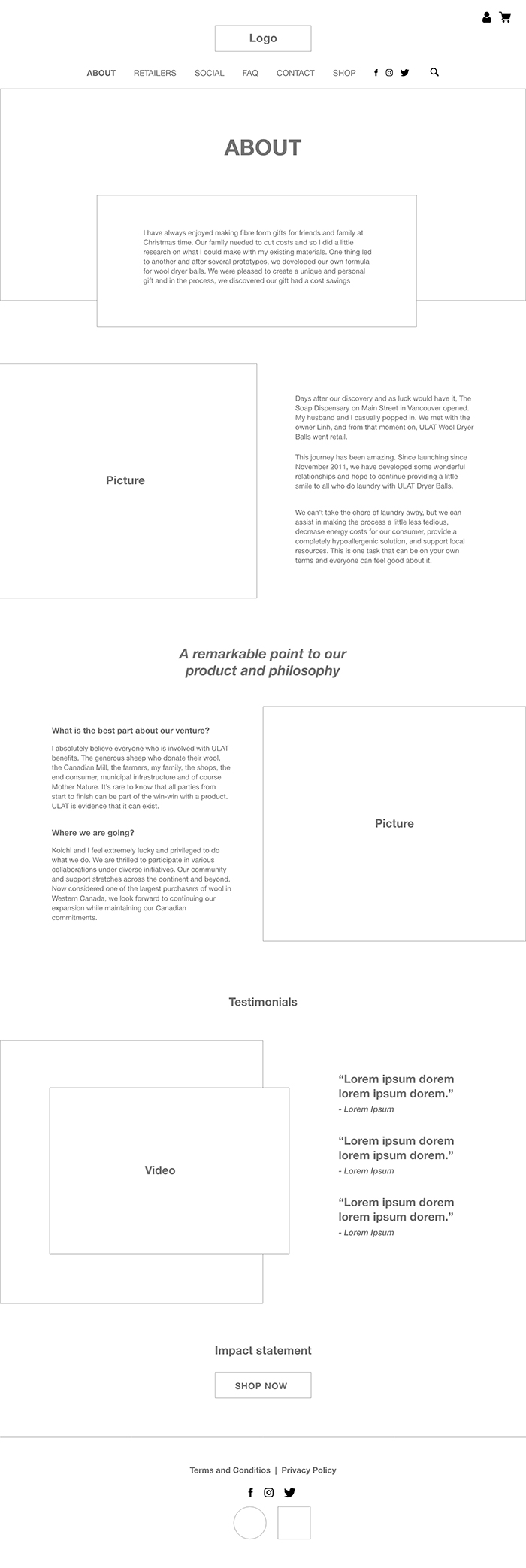
WIREFRAME
I placed strategic content and CTAs across the pages to invite customers to shop the product.
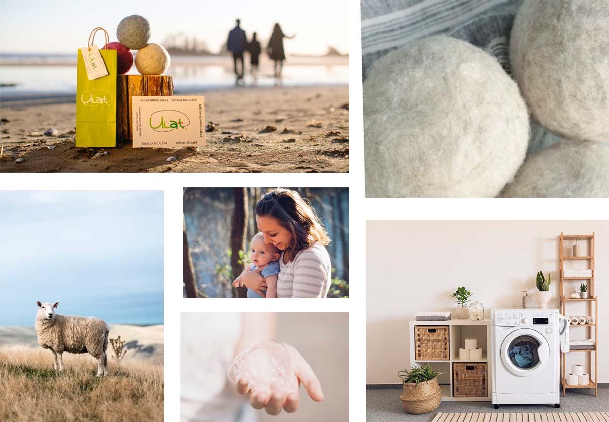
MOODBOARD
As previously explained, I focused on bright colours and happy imagery to give a feeling of hope and positivity.
HIGH FIDELITY PROTOTYPING
Adobe XD, Photoshop, and Illustrator were used to create the following high-fidelity designs.
DESIGN ELEMENTS AND STYLE GUIDE
Logo

(Previously designed by ULAT)
Fonts

Colours
#a0c795
#bcd5c9
#eef1ef
#72827a
#818f86
Iconography
PRODUCT LAUNCH AND LESSONS
I developed the final website using WordPress and WooCommerece for the store. One of the biggest lessons I learned from this project was to properly manage the client’s expectations in regard to the budget from the very begging. Since this project was first launched, the design has changed a bit, yet the basic website structure and some of the design elements still remain.
