Team
Freelance project
Deliverables
Corporate website design and development. Brand strategy.
Role
UX Designer | WordPress Developer | Brand Strategist
Tools Used
Adobe Creative Suite, HTML, CSS, PHP, WordPress CMS, InVision
Live Website
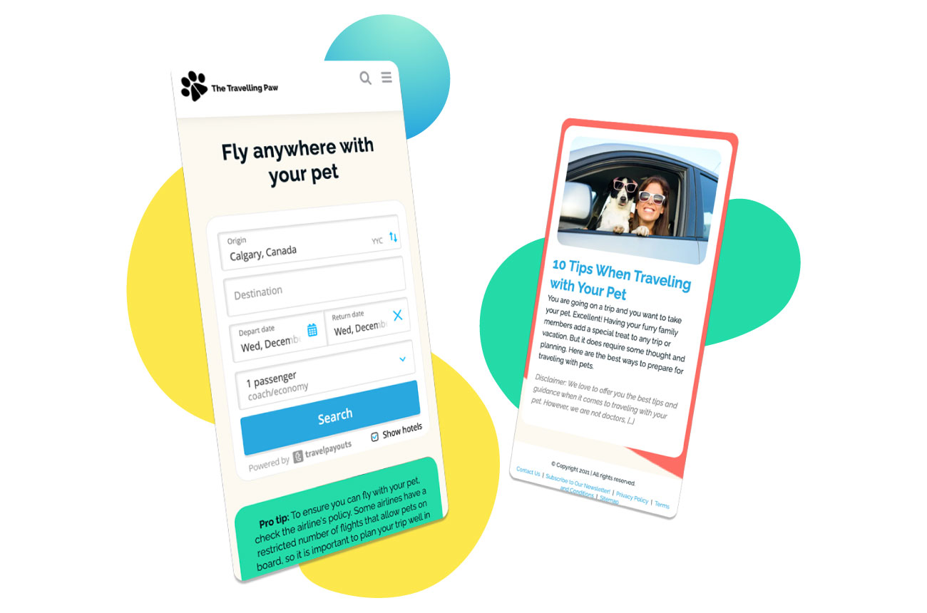
The Travelling Paw is a company dedicated to helping pet owners to travel with their pets. For this project, the scope consisted in creating a friendly and distinctive brand, as well as a website that allowed users to easily find all the resources they need in order to travel with their pets easily.
THE PROCESS
Discovery
User and Market Research
Concept Design
Customer Journey, User Personas, Site Architecture
Concept Development
High Fidelity Prototypes
Development
Evaluate
Launch
DISCOVERY
What is the goal?
To get users to make reservations at pet-friendly hotels and use other travel services on the site.
What are the main challenges/opportunities?
Travel websites tend to have a lot of information, and as a generalization, they tend to be crowded, making it harder for the user to have a seamless experience. The challenge for this project – from a UX perspective – was to simplify as much as possible the process of making hotel reservations, booking flights, and accessing the required information – especially because the company relied on third-party software, where the ability to manipulate the user experience is limited.
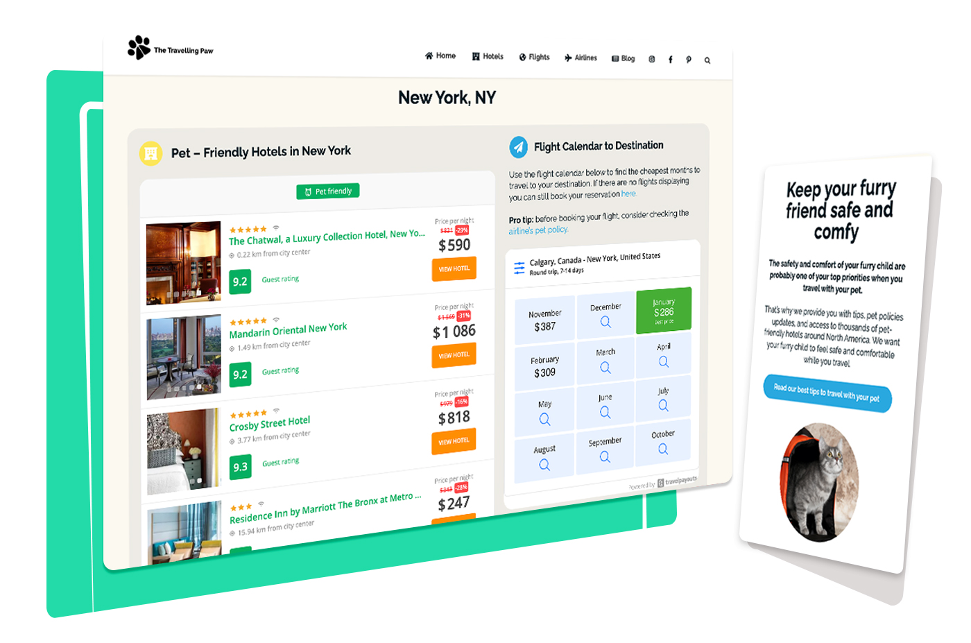
In order to solve these challenges, I decided to focus on creating location pages with curated content, delivering only the most relevant information, and designing simple layouts that encouraged users to focus on the main calls to action.
Who is the audience?
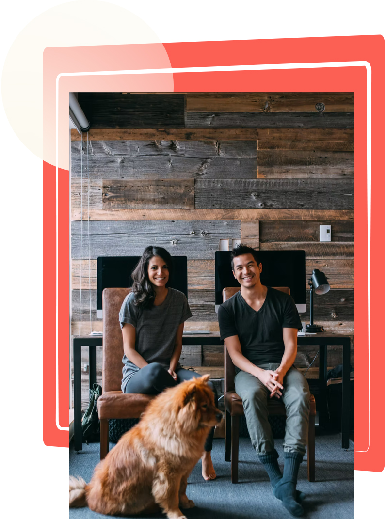
30-years-old and plus families with pets.
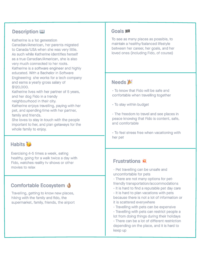
USER PERSONA
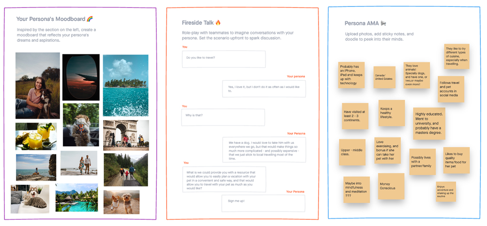
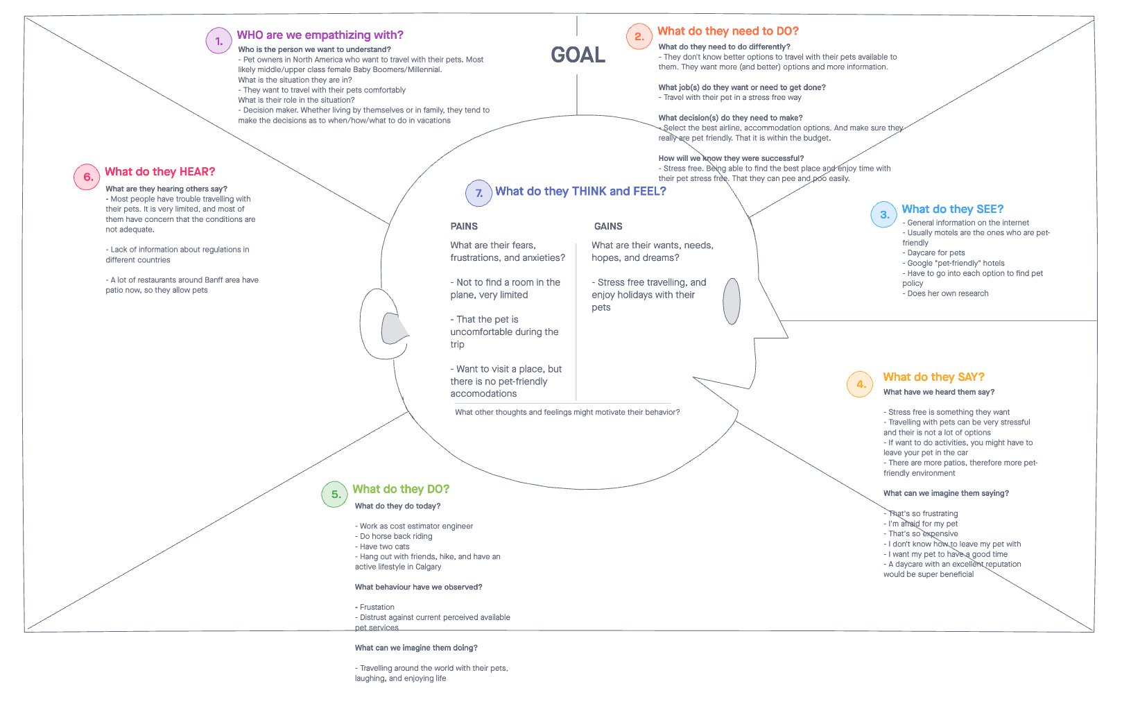
EMPATHY MAP
The Empathy Map tool helped me understand how our users might feel, think, and act when presented with the situation of travelling with their pets. This tool also helped me identify areas of opportunity of how the website might help ease negative emotions while promoting positive responses.
CONCEPT DESIGN
INFORMATION ARCHITECTURE
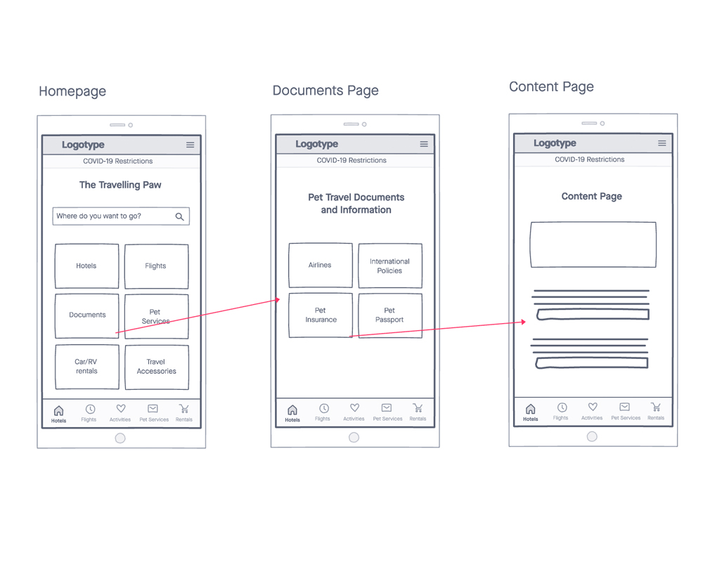
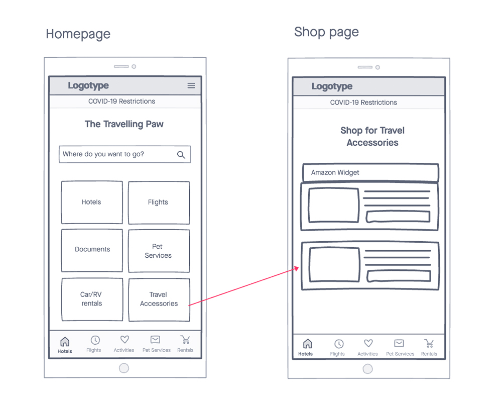
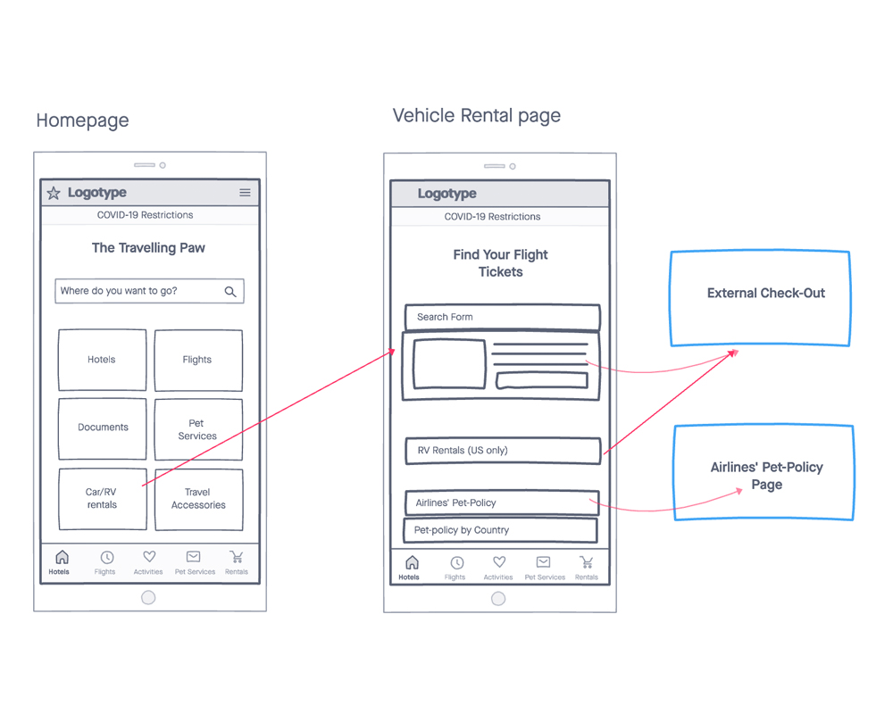
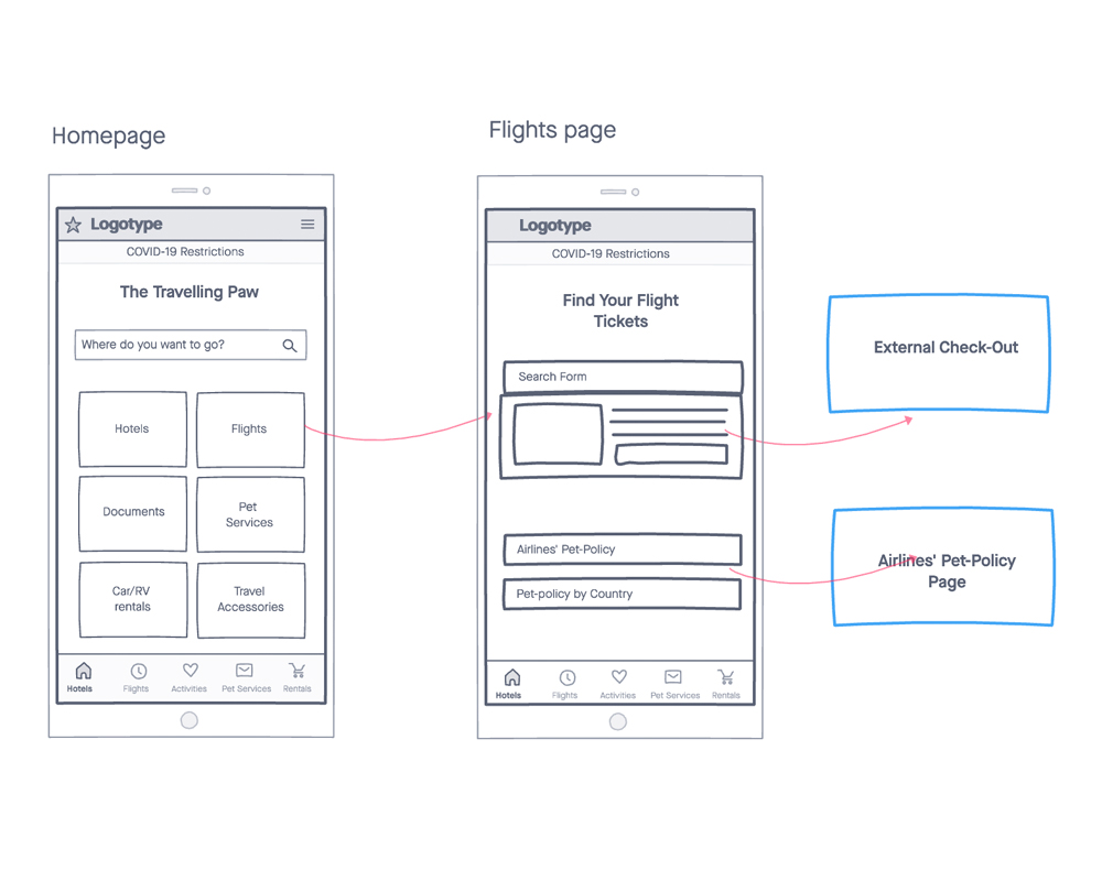
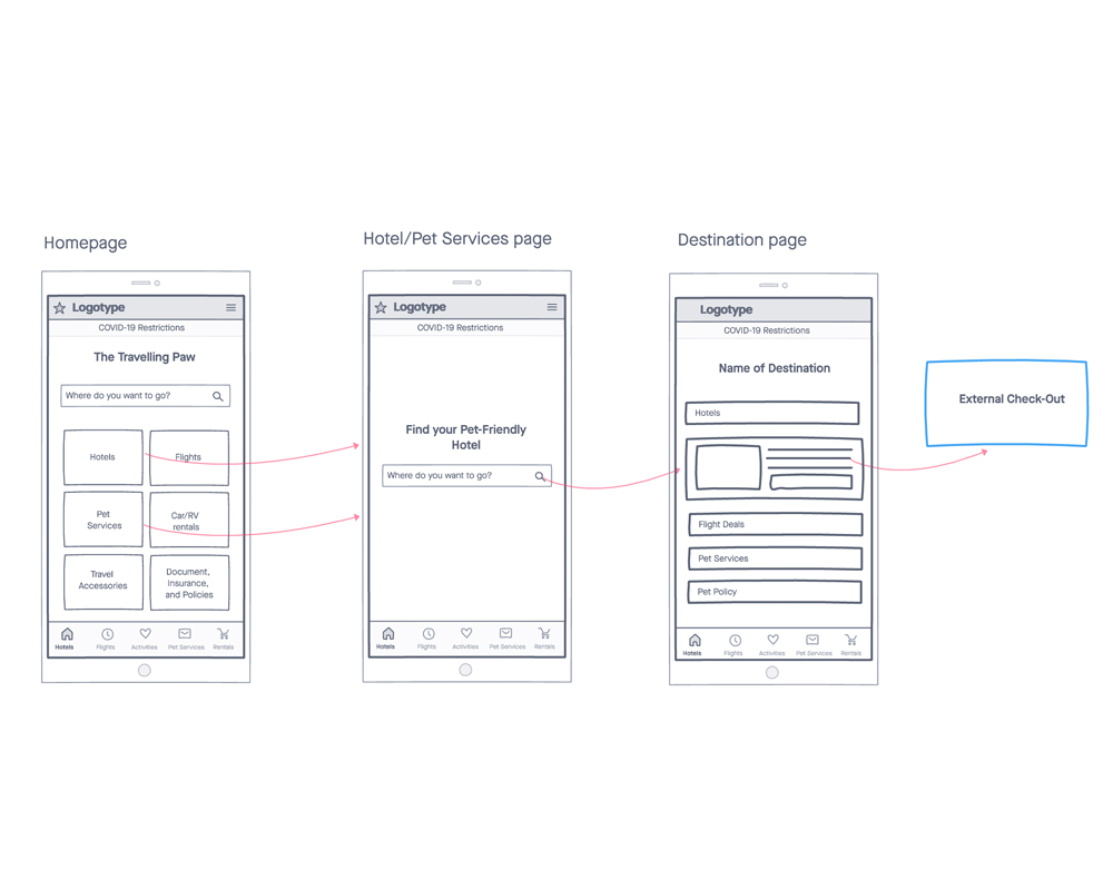
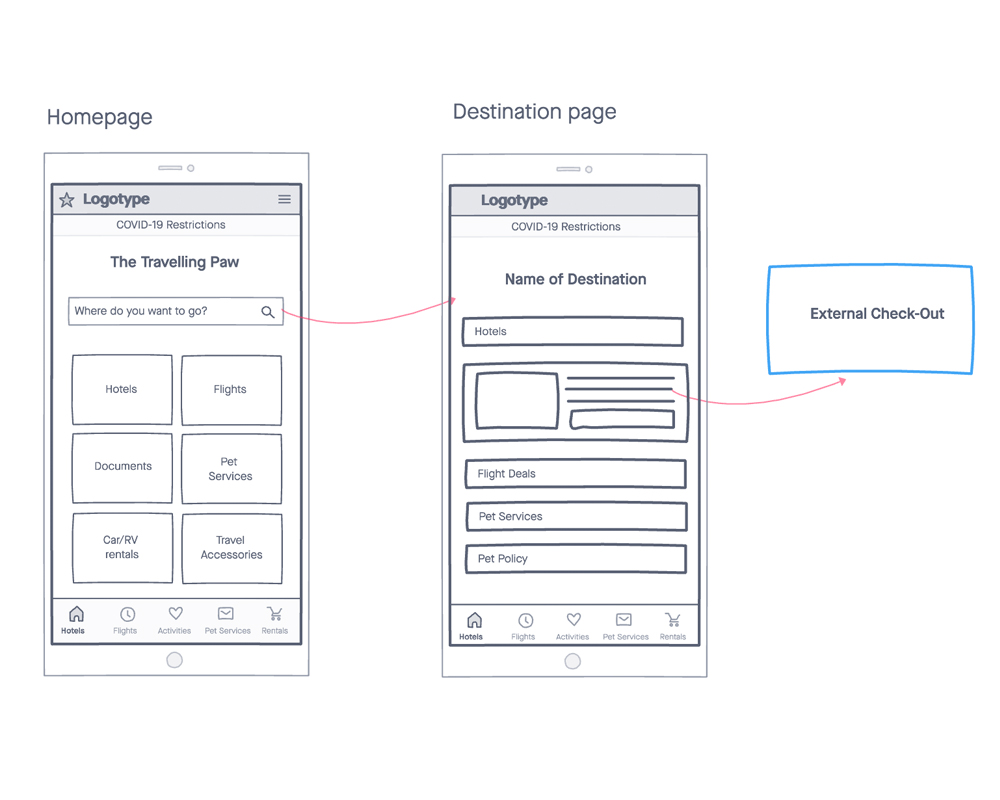
For this project, I decided to take a different approach from traditional user flow charts and experiment a bit with wireflows. What I liked about this approach is that it gave me a clearer idea of how users might interact with the interface.
WIREFLOW
SITEMAP

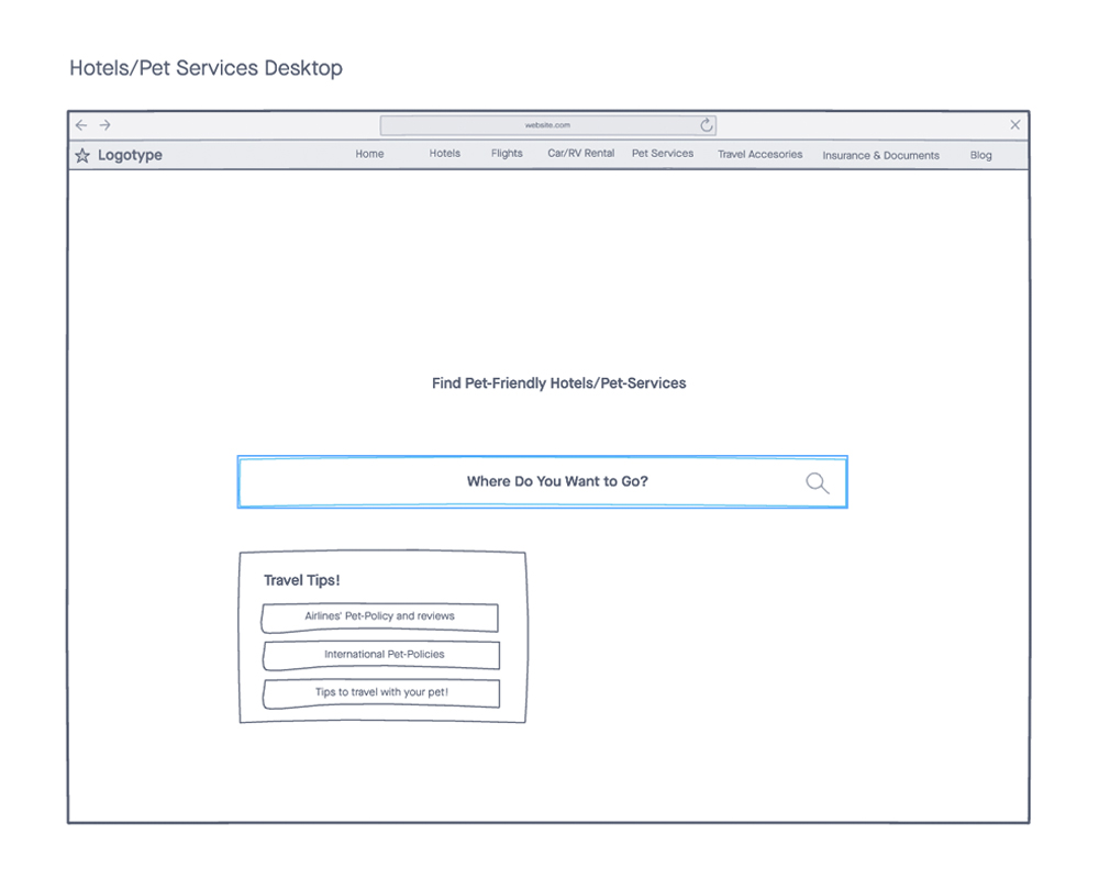
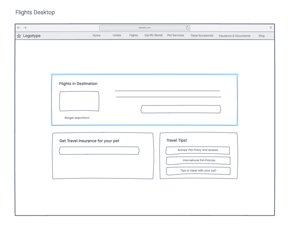
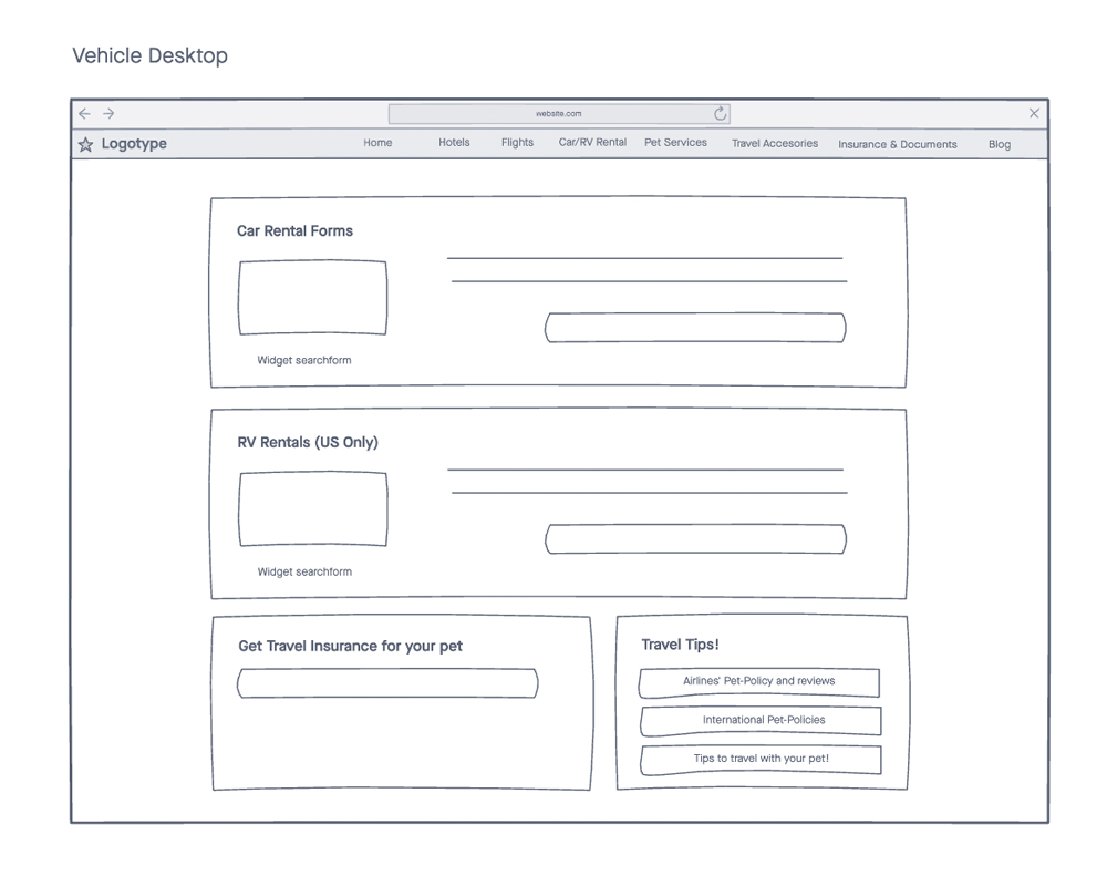
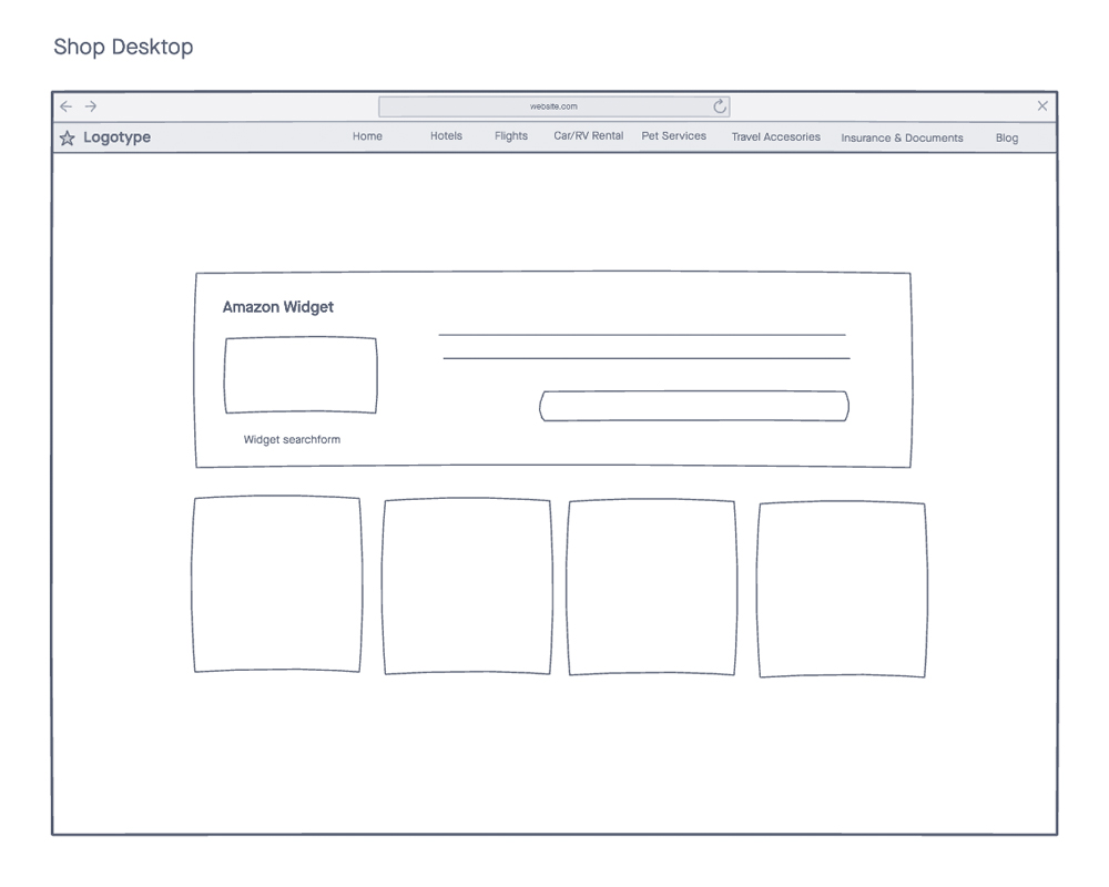
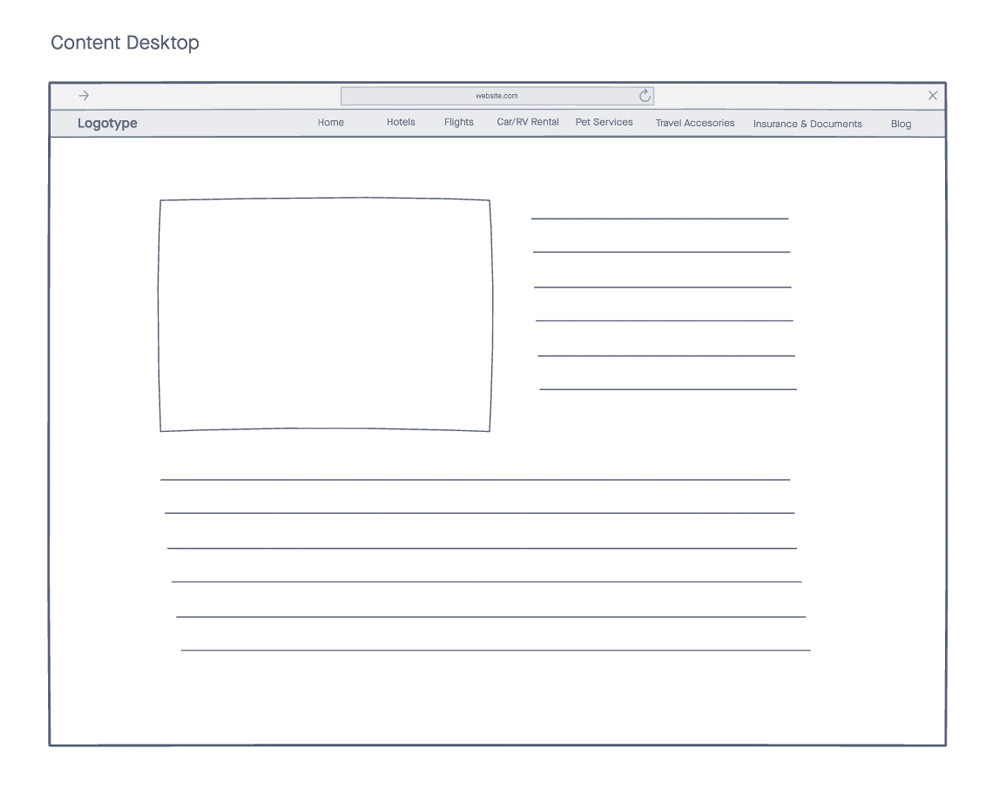
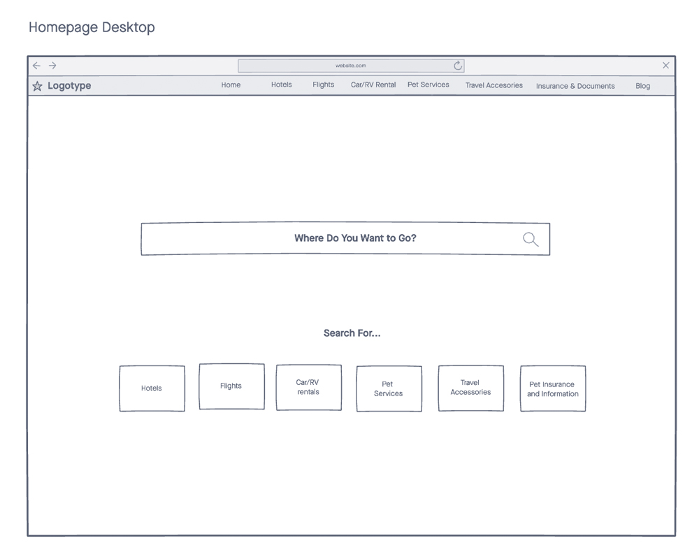
WIREFRAME
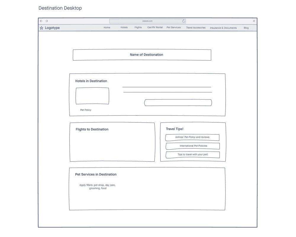
Having a clearer idea of what the interface and its flow might look like in mobile view from the previous wireflows, I proceeded to create desktop view wireframes.
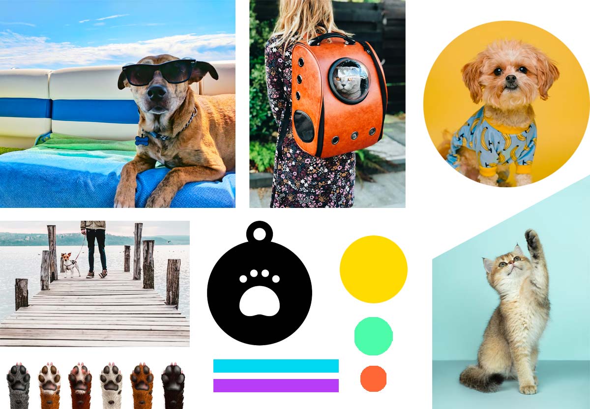
MOODBOARD
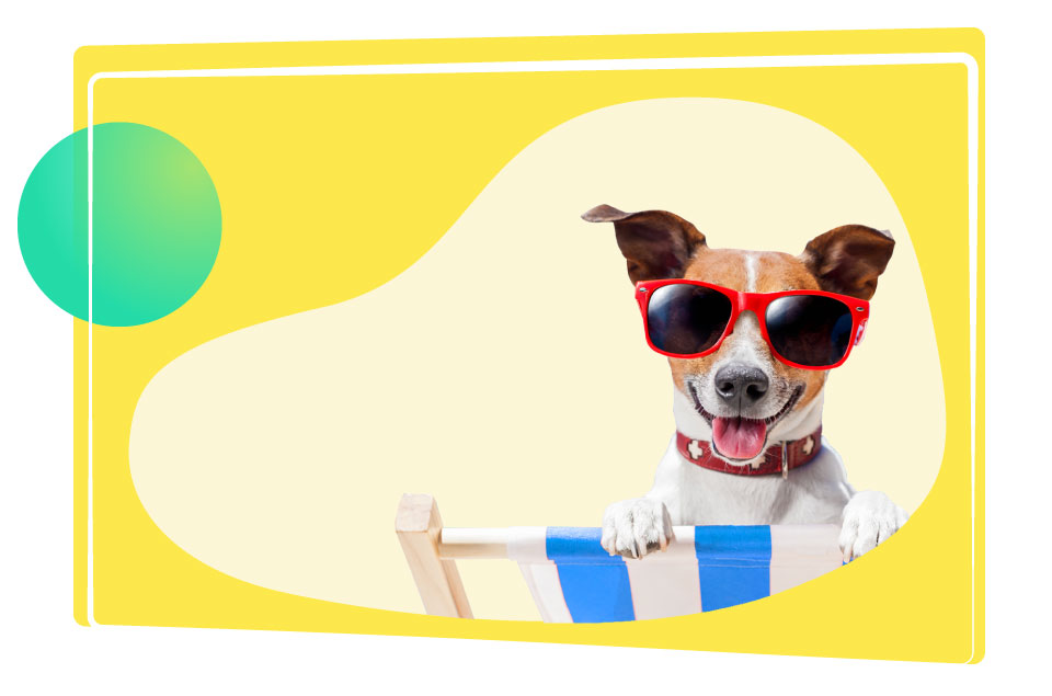
Bright colours and feel-good pictures are the cornerstones of The Travelling Paw brand.
HIGH FIDELITY PROTOTYPING
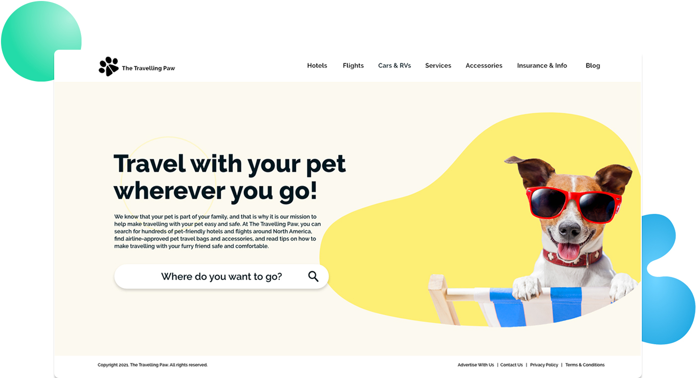
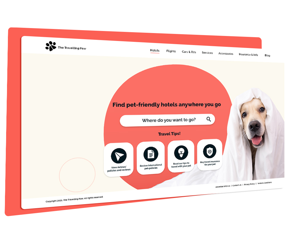
For the design, I wanted the look to be bright, bold and simple. Inspired by Art Deco and Bauhaus, I wanted to reinforce the idea of a simple and effective interface. Also, since the theme of the company is travel and pets (usually a fun subject) I wanted the pictures and the overall feeling to be lighthearted and fun – hence the funny pictures and bright colours.
DESIGN ELEMENTS AND STYLE GUIDE
Logo

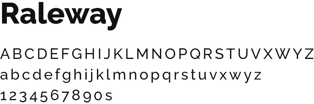
Fonts
Colours
#FDE84C
#00A7E1
#00171F
#1ADBA8
#FF5F55
#FCF9EF
