Team
P2C’s Marketing team
Deliverables
Corporate website design and development
Role
Project lead, web design direction, UX research, UX Design, WordPress development, website testing.
Power to Change (P2C) is the umbrella organization of 11 ministries. The P2C marketing team was looking to replace the organization’s old corporate website to better suit the needs of their audience, and give it a much-needed revamp. The website has been updated since this design implementation.
THE PROCESS
Client Discovery
User and Market Research
Concept Design
Customer Journey, User Personas, Site Architecture
Concept Development
High Fidelity Prototypes
Development
Evaluate
Launch
DISCOVERY
What is the goal?
To design and develop a corporate website that attracts a younger generation of online donors and increases the organization’s brand awareness.
What does success looks like?
Increased number of page visits, increased number of online donations, and an increased number of key interactions such as email subscriptions.
Who is the audience?
The primary audience is young Christians in Canada aged 18 – 35 years old. The secondary audience is existing followers who are familiar with the organization.
CONCEPT DESIGN
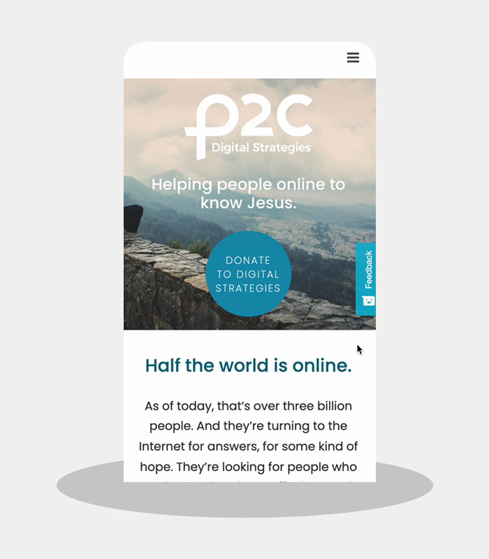
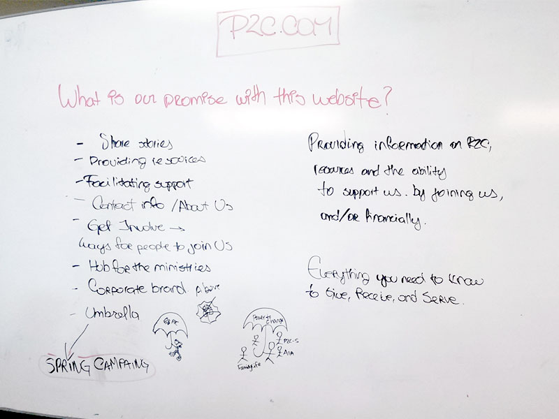
P2C is the umbrella organization of 11 ministries, that is to say, of 11 different brands. One of the main challenges when designing and building the website, was to design it in such a way that correctly represented each of the ministries while preserving a cohesive brand experience.
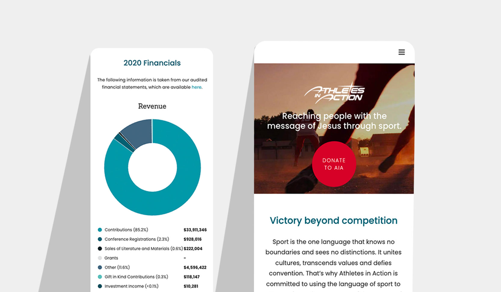
Being a legacy organization, we also wanted to appeal to younger generations that were not as familiar with the brand as their parents were. To accomplish this, we opted for a simple, modern and colourful look, while making sure that mobile responsiveness was a top priority.
RESEARCH
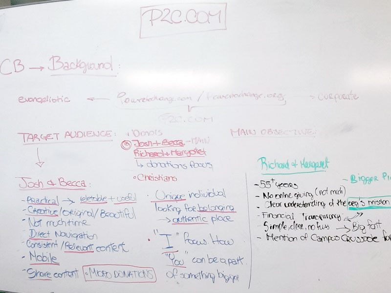
Before starting with the concept design, my colleague and I conducted UX research among our target audience. Part of the research included article reviews, personal interviews, and a survey. Some of the main findings were that younger generations found our previous website too difficult to navigate, inaccessible, and overall aesthetically unattractive, therefore participants refrained from visiting the website more than once.
Also, members of our own organization had refrained to use the corporate website as a fundraising tool for the same reasons, and because they felt their particular ministry was not being effectively represented. This was particularly worrisome, as having a credible website was a key part of the organization’s fundraising strategy.
INFORMATION ARCHITECTURE
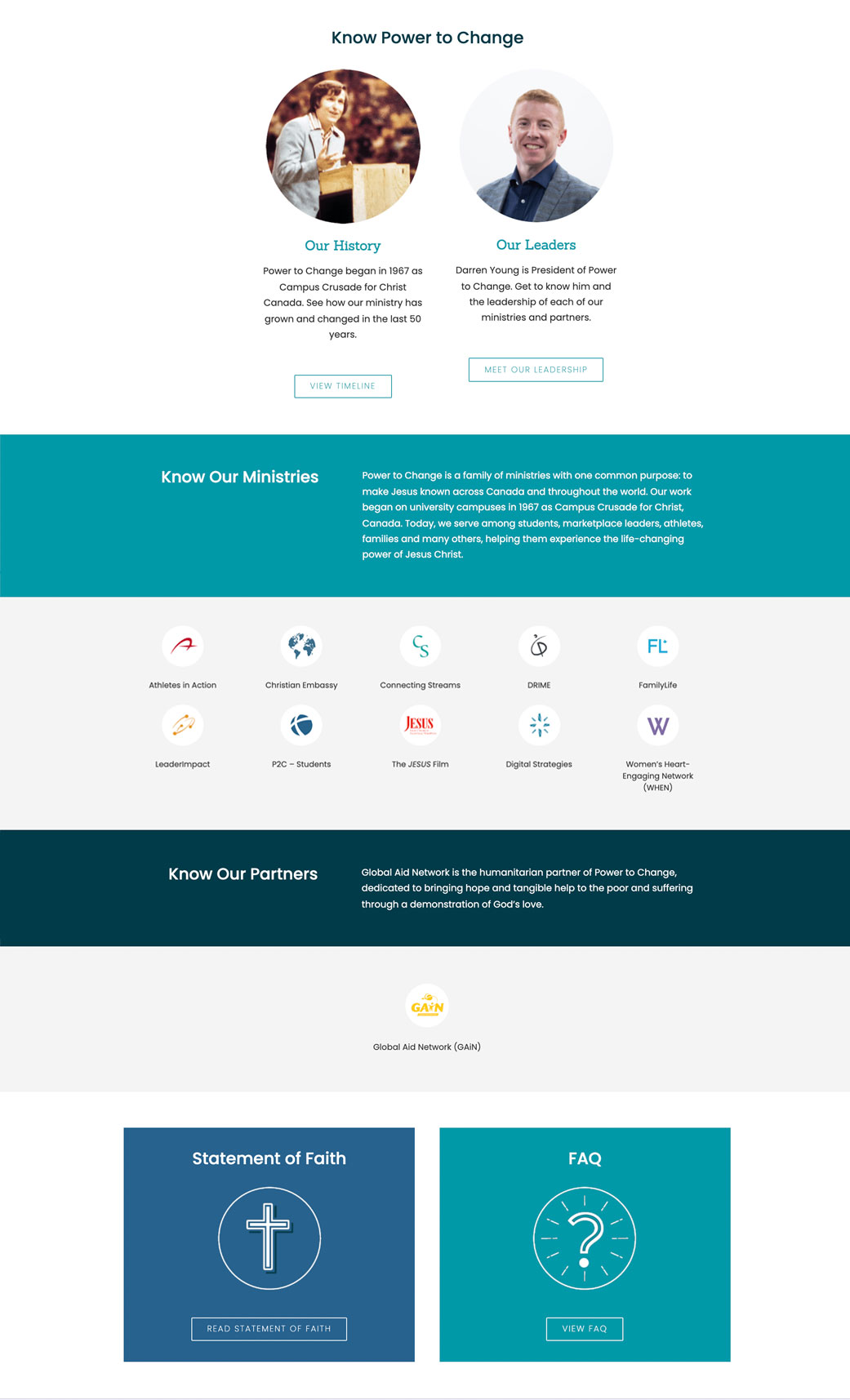
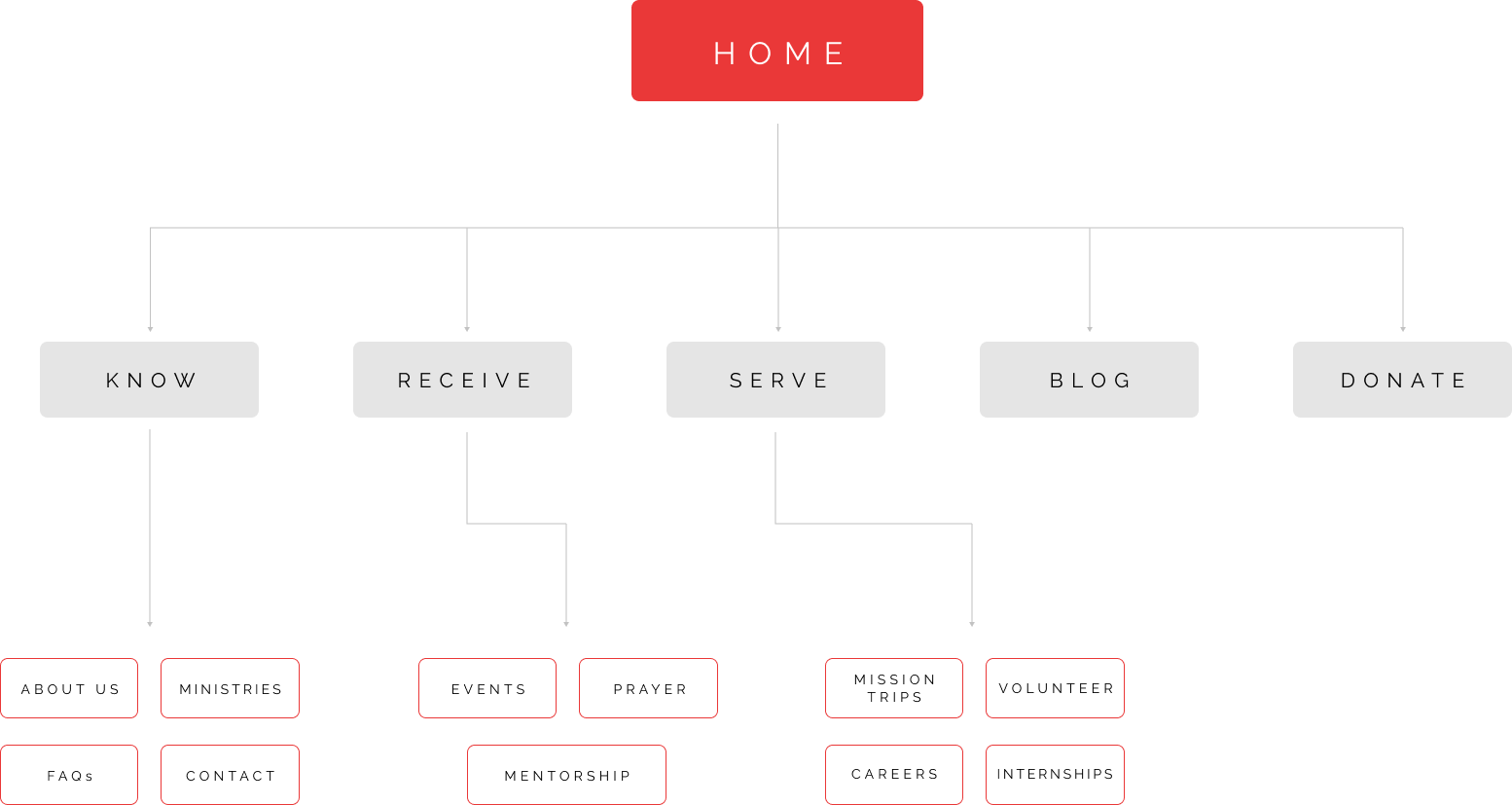
To make the site user-friendly and intuitive, we decided to organize the information by the main actions that users could take on our website. More specifically, we organized the information into 5 categories: “Know” where users can learn everything about the organization and its ministries, “Receive” where users can find all sorts of helpful resources, “Serve” a section where users can apply to volunteer, go on mission trips, or donate, “Donate” which is one of the main CTAs, and “Blog” which is pretty self-explanatory.
USERFLOW
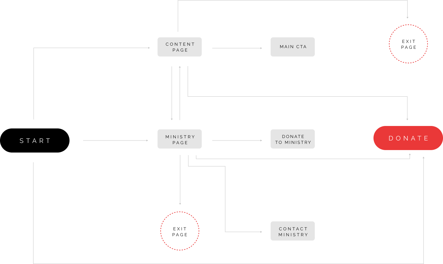
The goal was to create an user-flow that helped the user accomplish either (or both) of the website’s two main goals: to donate or to get to know more about the organization and spread branding awareness.
SITEMAP
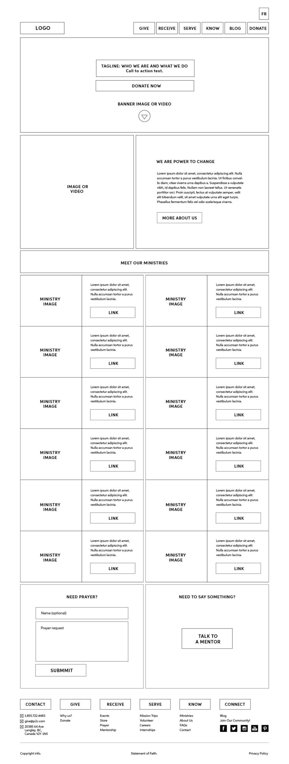
WIREFRAMES
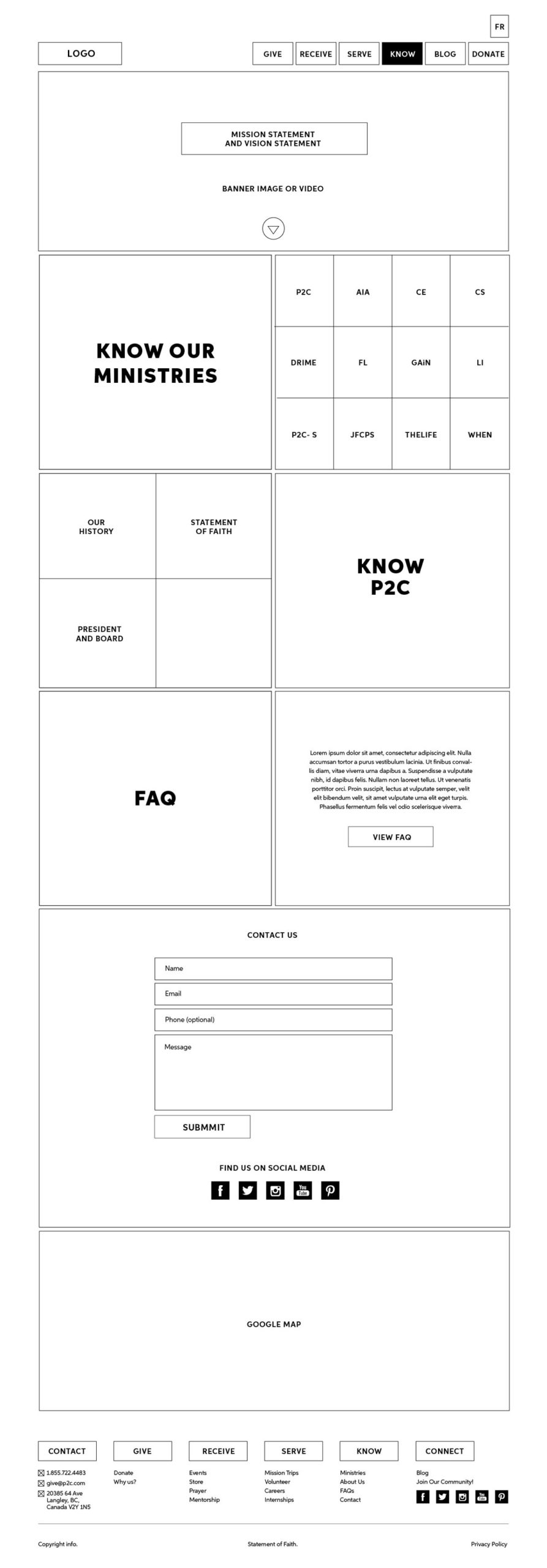
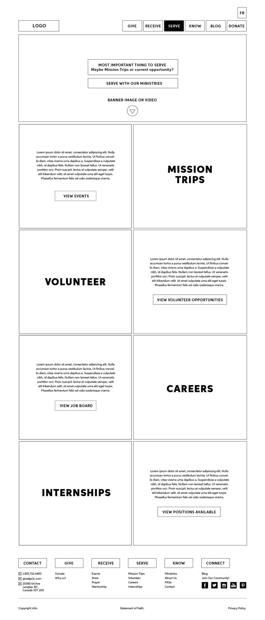
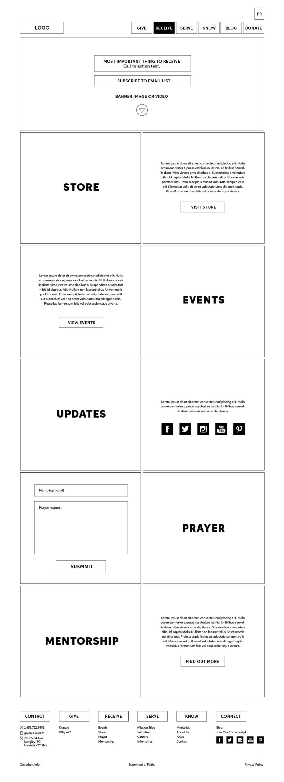
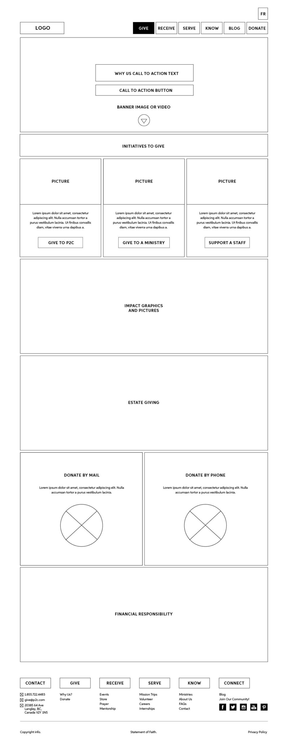
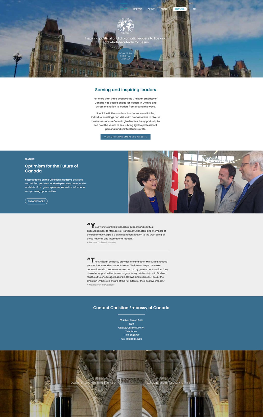
Wireframe planning was a key element not only in helping create an effective UX experience but also in unifying the 11 ministries’ distinctive brands. Given that each ministry had its own logo, colours, message, and fonts, I decided to create a similar wireframe structure among all the ministries’ pages in order to demonstrate a unified look that showcased all the ministries as part of the same organization.
This also helped with the development process as it was important to have standardized design elements that could be easily replicated by code.
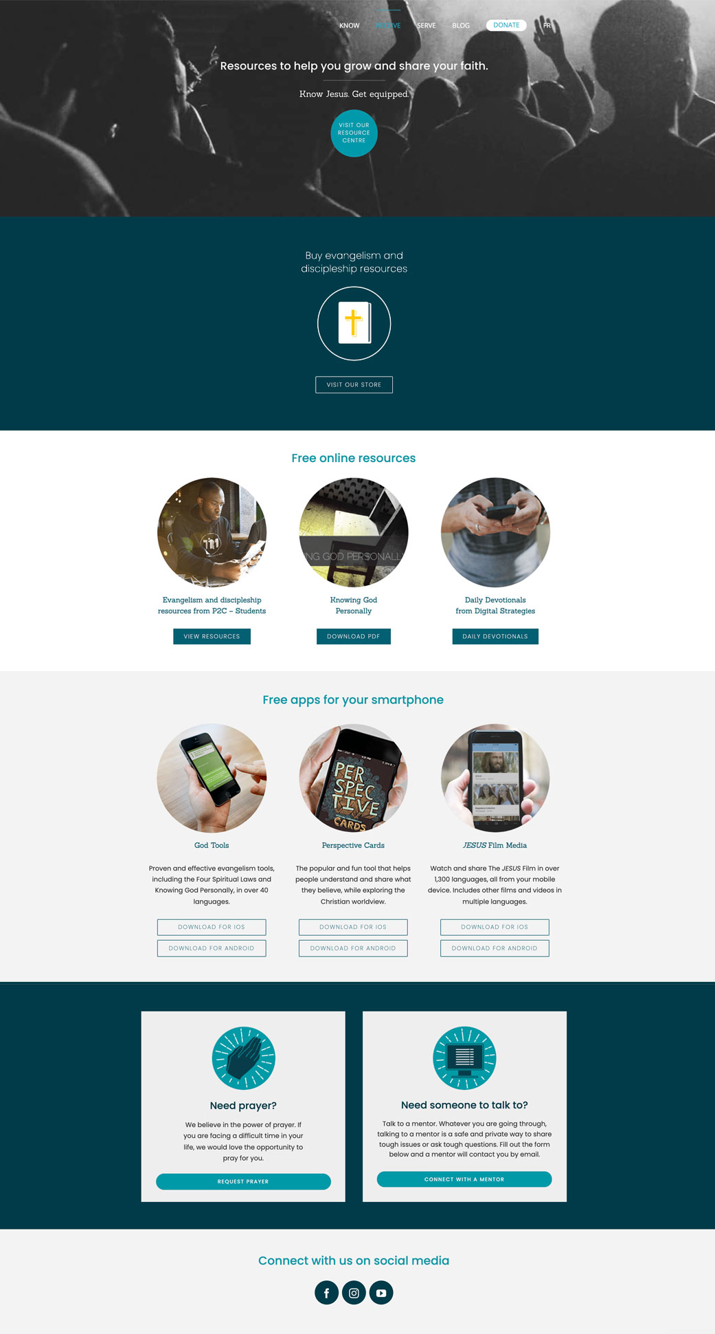
HIGH FIDELITY PROTOTYPING
Tools such as Sketch, Illustrator, and Photoshop were used in order to create high-fidelity prototypes. During the whole design process, we would gauge feedback from stakeholders.
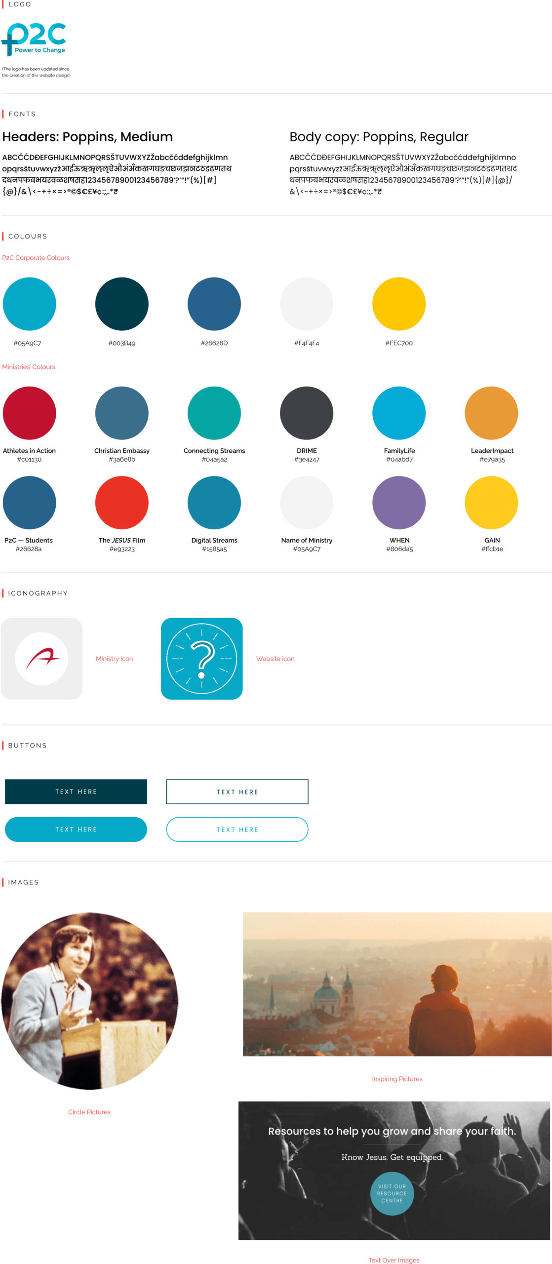
DESIGN ELEMENTS
WEBSITE STYLE GUIDE
PRODUCTION AND LAUNCH
For the production of the website, I was in charge of developing the front-end while the IT team was in charge of developing the back-end, as well as the donation platform. In order to develop the front-end, I used WordPress CMS, HTML, CSS, JavaScript, and PHP. Various performance and user tests were conducted before launching. We also implemented Google Tags and Analytics to help us track the website’s success.
The launch was a great success among the organization staff, and soon after other ministries were asking the P2C Marketing team to develop new websites for them (which helped to increase corporate culture trust). What’s more, our online visits increased, and we were able to create successful online campaigns that resulted in never-seen-before amounts of online donations.
