Team
Estefania Hernandez – UX Designer
Eleanor Ruthenberk – Art Director
Global Fingertips IT team – Website Development
Deliverables
UX Designs for the new GF website
Role
UX Designer
GlobalFingerprints is the child sponsorship ministry of the Evangelical Free Church of America. Their mission is to send children to school and help care for their physical, spiritual, and emotional needs. The project consisted of designing and developing a new corporate site, as well as redesigning GlobalFingerprints’ sponsorships website. The website’s design has been updated since the implementation of this design.
THE PROCESS
Client Discovery
User and Market Research
Concept Design
Customer Journey, User Personas, Site Architecture
Concept Development
High Fidelity Prototypes
Development
Evaluate
Launch
DISCOVERY
What is the goal?
The main goal for the website was to provide an easy flow for new and returning users to sponsor the children. The challenge – or rather the opportunity – for this project, was to create a seamless experience for new users to get to know what GlobalFingerprints was all about, while at the same time offering an easy process that encouraged users to sponsor more children.
What does success looks like?
Increased number of children sponsorships through the website.
Who is the audience?
The primary audience is the people involved in theEvangelical Free Church of America.
CONCEPT DESIGN
Many humanitarian organizations base their marketing on fear and guilt. However, with the new Global Fingerprints website, we wanted to give our audience the ability to experience the joy of making a positive impact on a kid’s life.
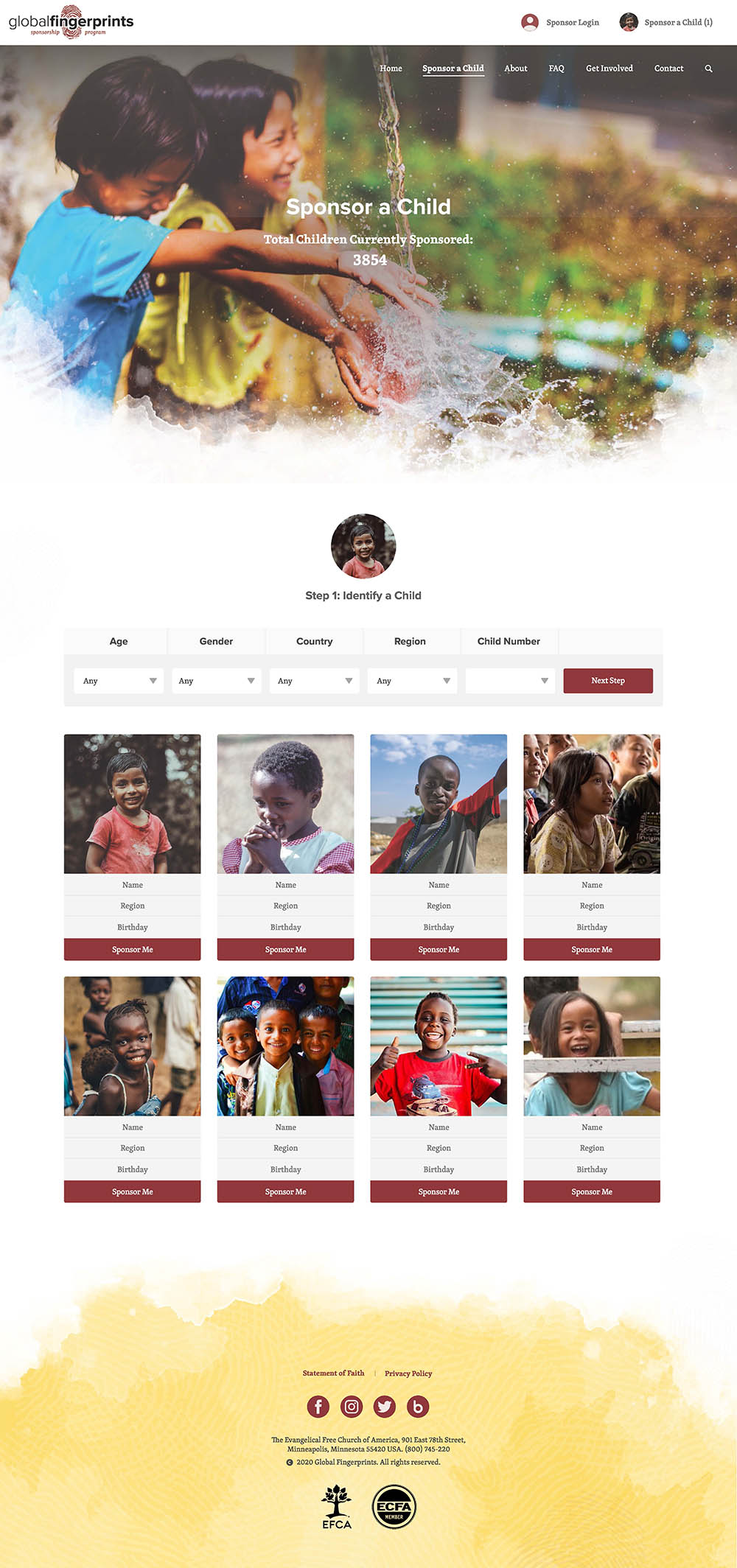
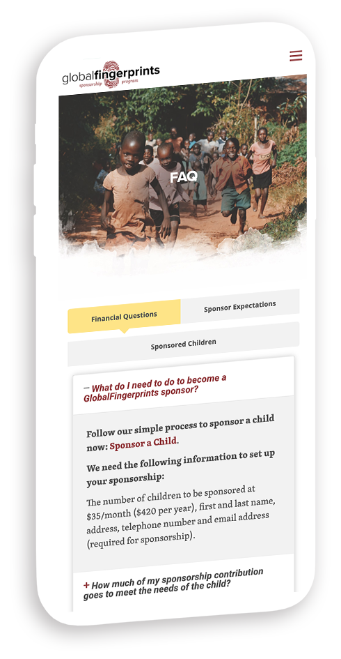
For this reason, the imagery and design direction are represented by bright colours and happy pictures that told the spectator “thanks to you we can make a positive difference”.
INFORMATION ARCHITECTURE
From a UX perspective, one of the most important aspects of the design was to simplify the process of supporting a child. From getting to know a child’s background to subscribing to a monthly donation, the goal was to take the user on a smooth journey, where all the friction of decision-making points was significantly reduced.
USERFLOW
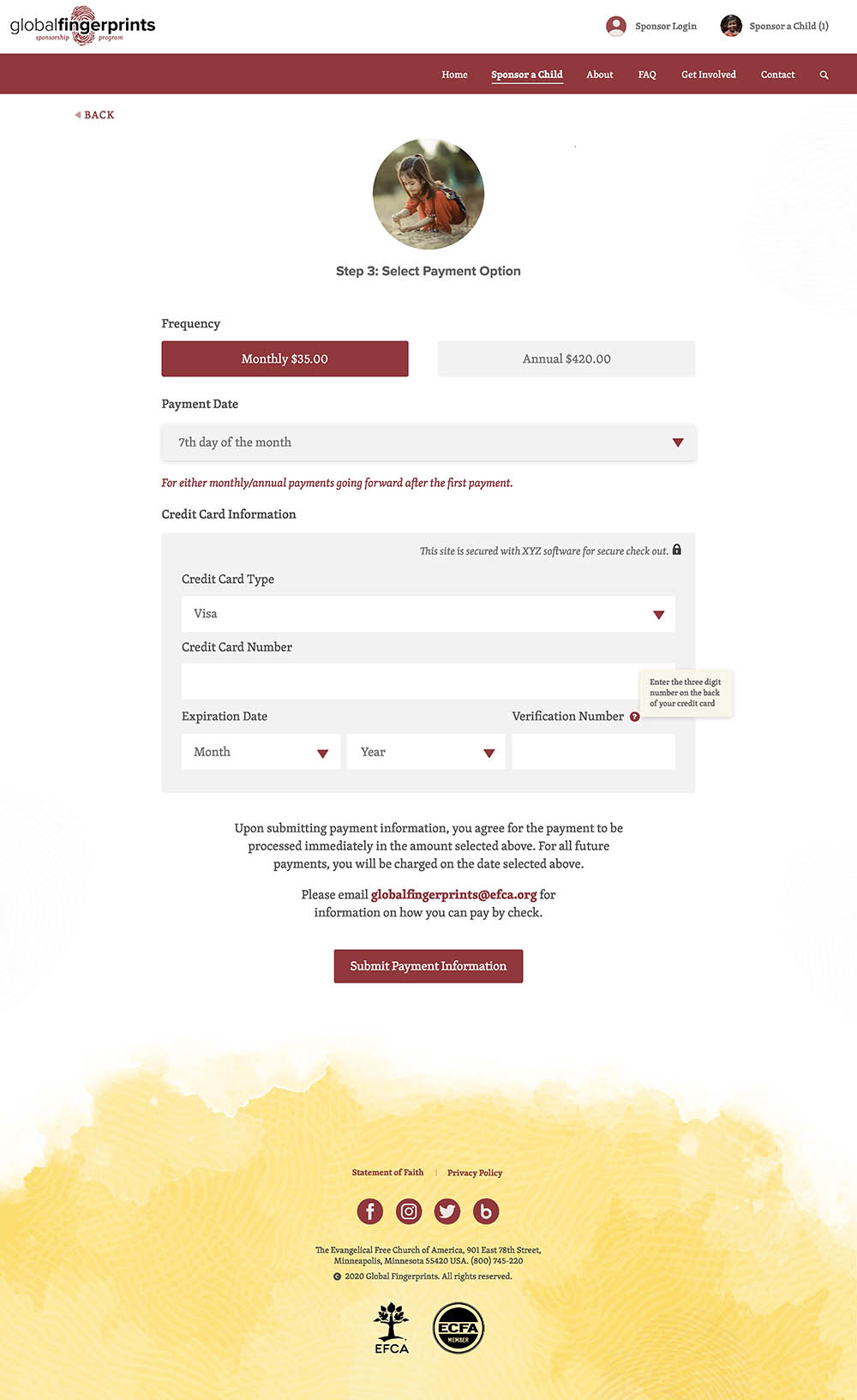
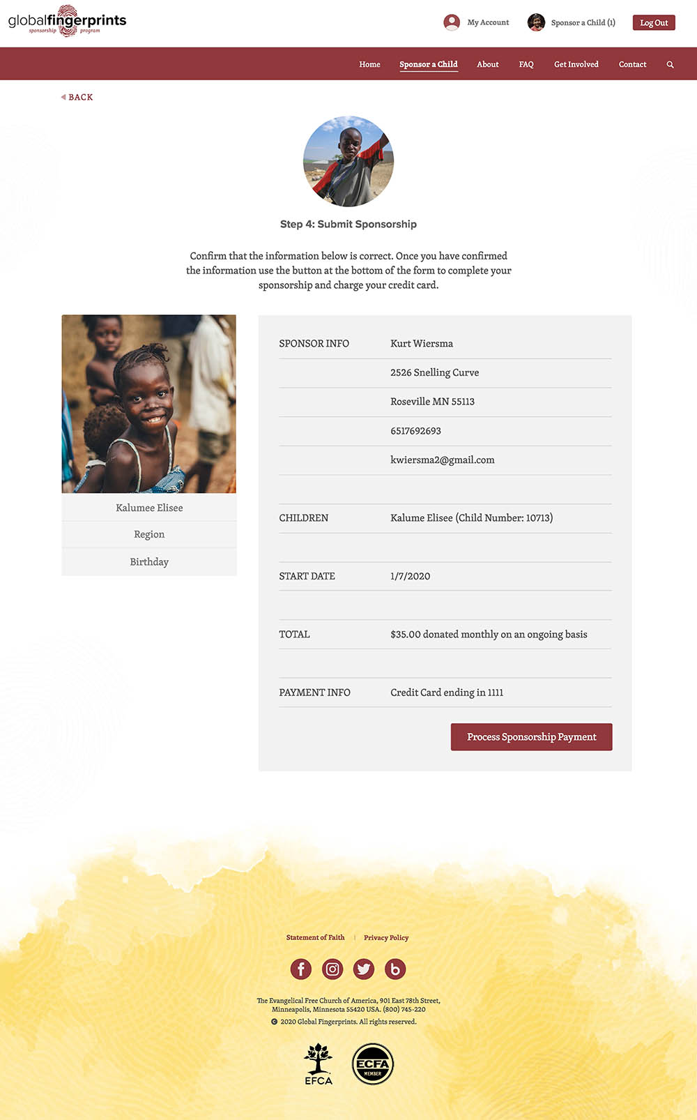
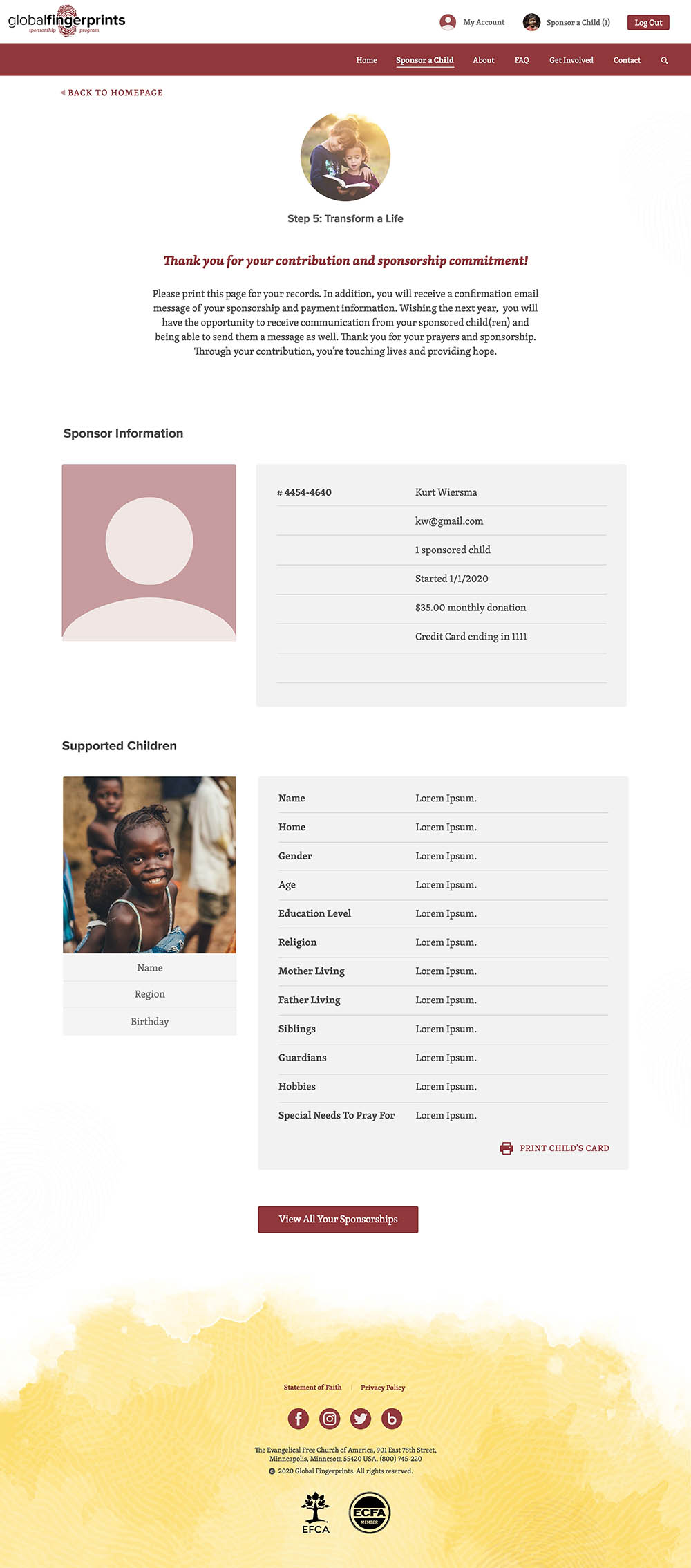
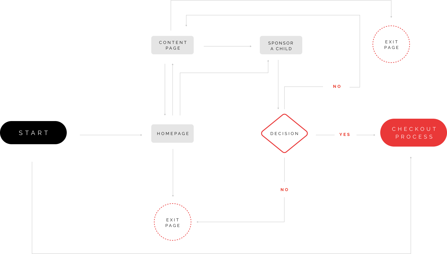
The userflow was designed to be straightforward so as to guide the user towards the main goal: sponsoring a child. Along with the Art Director, I assisted in developing a 5-steps process that would efficiently and effectively inform the user in regards to what they needed to know to make an informed decision while encouraging them to subscribe to a monthly donation.
SITEMAP
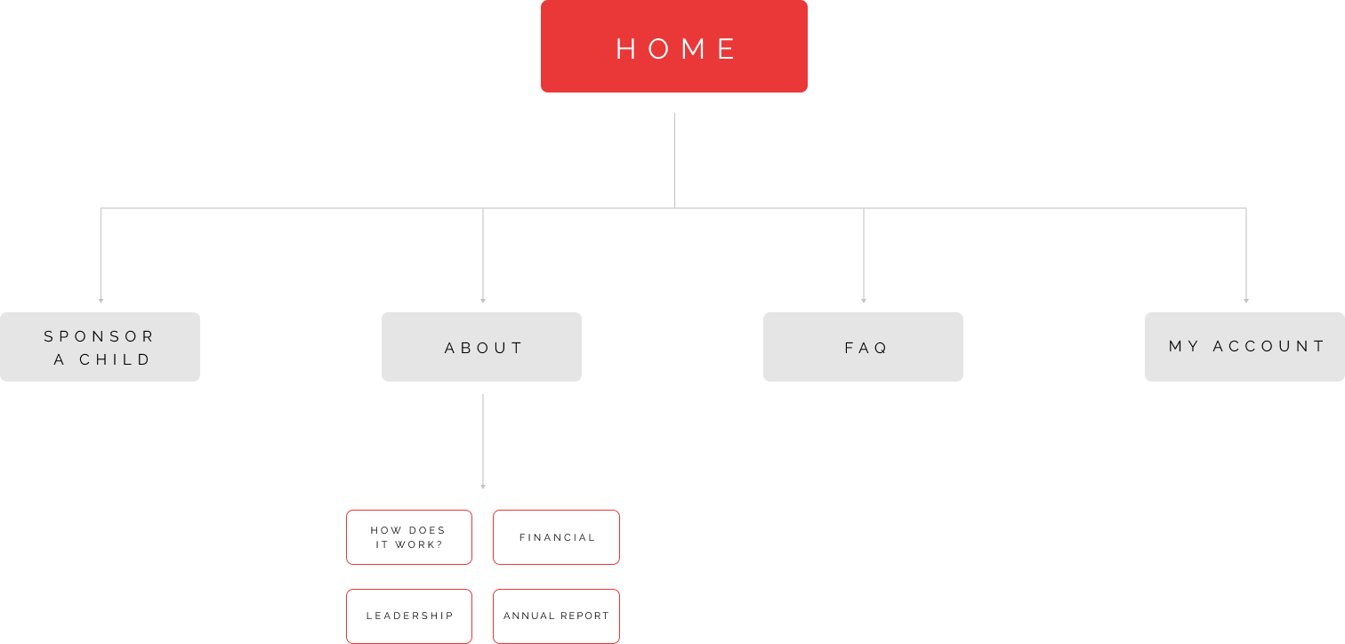
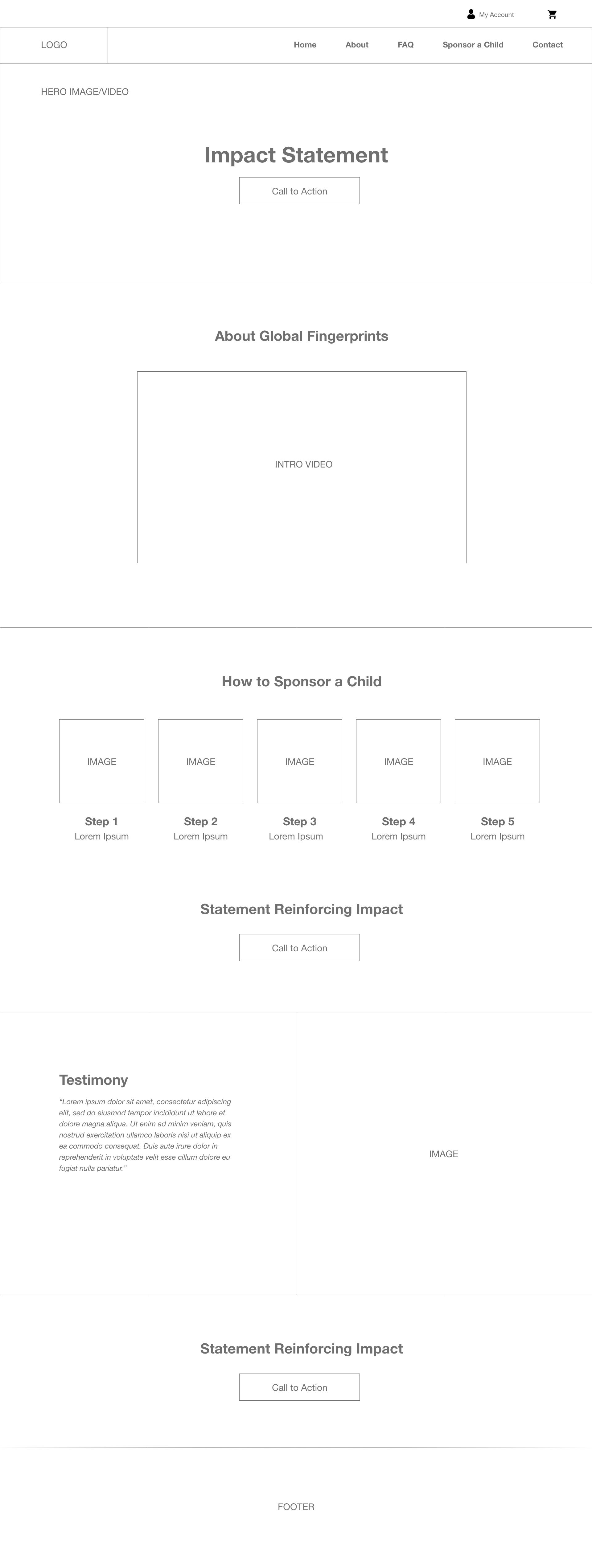
WIREFRAME
Due to the financial constrains of the project, the wireframe was design to be easily repiclated to the site. This allowed for an effective UX solution while being budget-friendly.
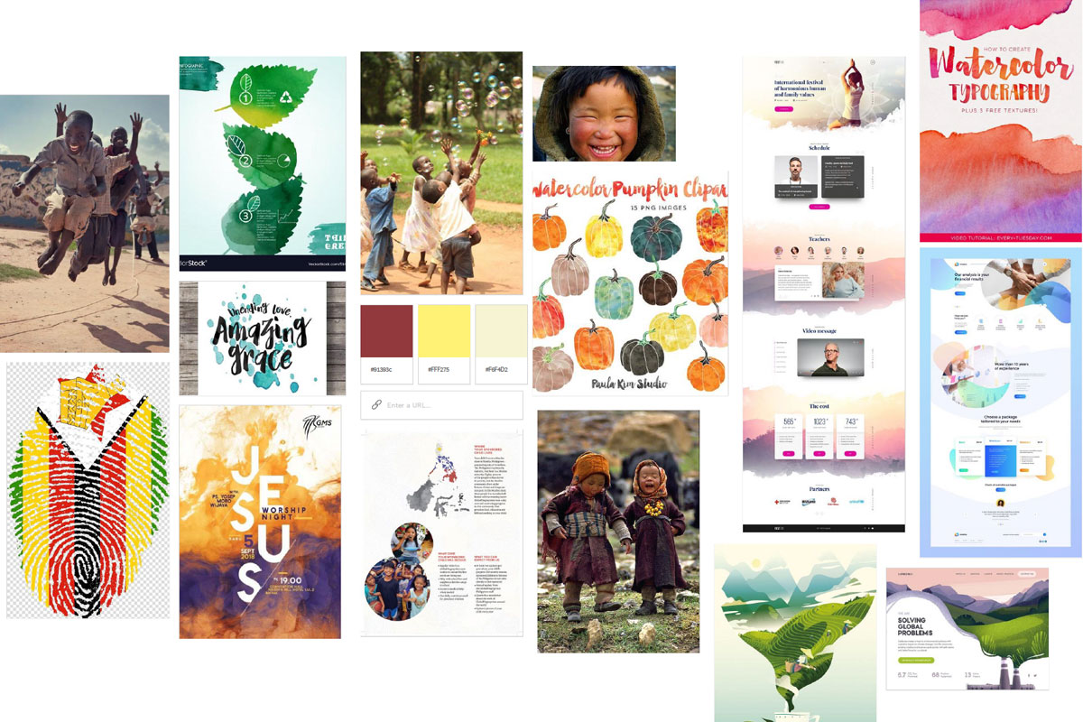
MOODBOARD
As previously explained, I focused on bright colours and happy imagery to give a feeling of hope and positivity.
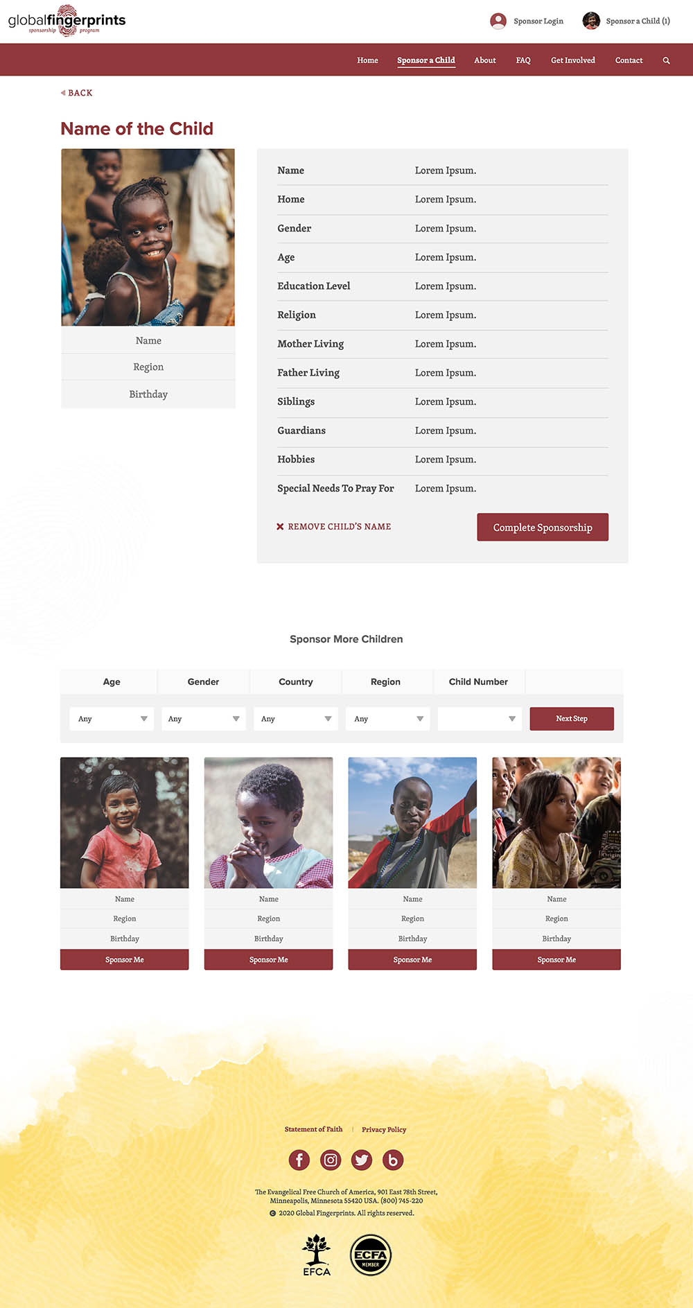
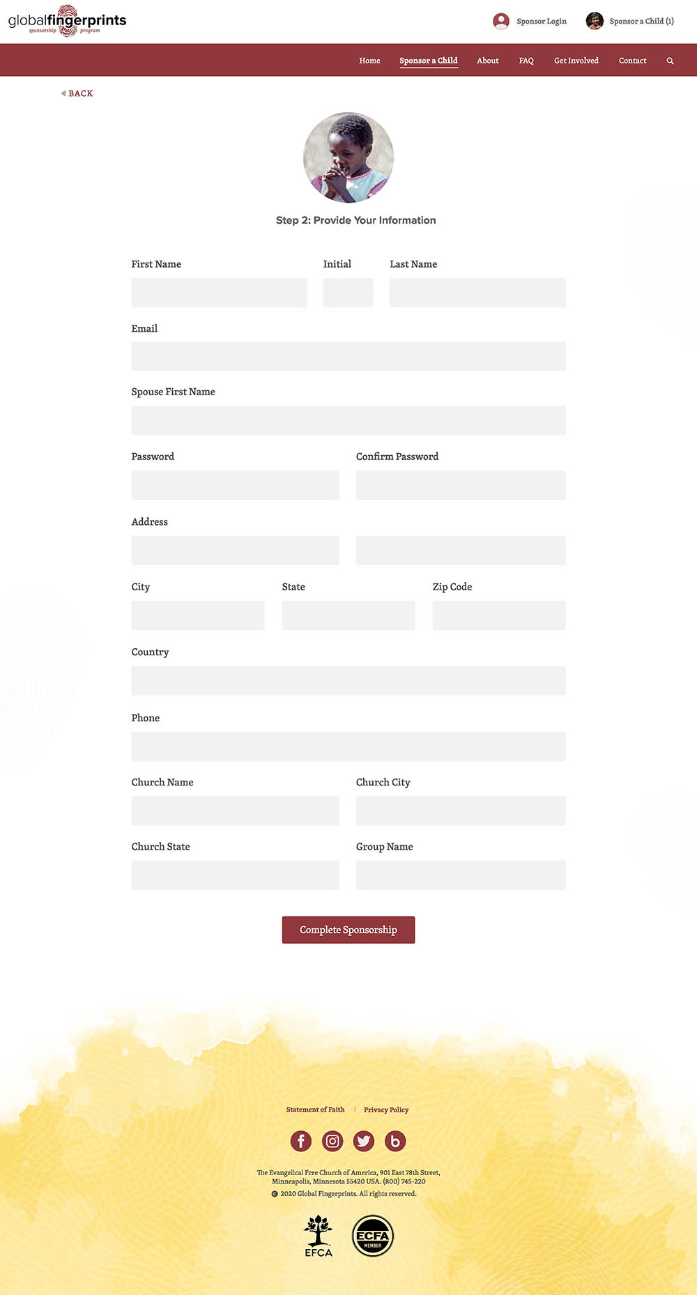
HIGH FIDELITY PROTOTYPING
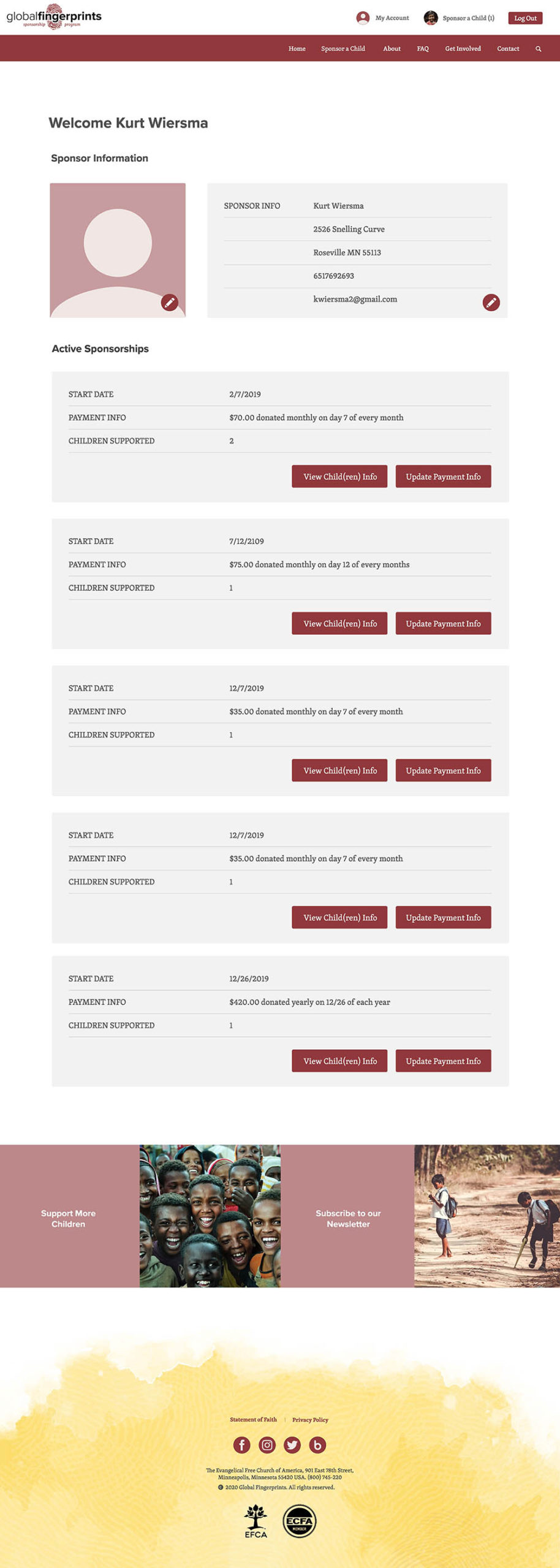
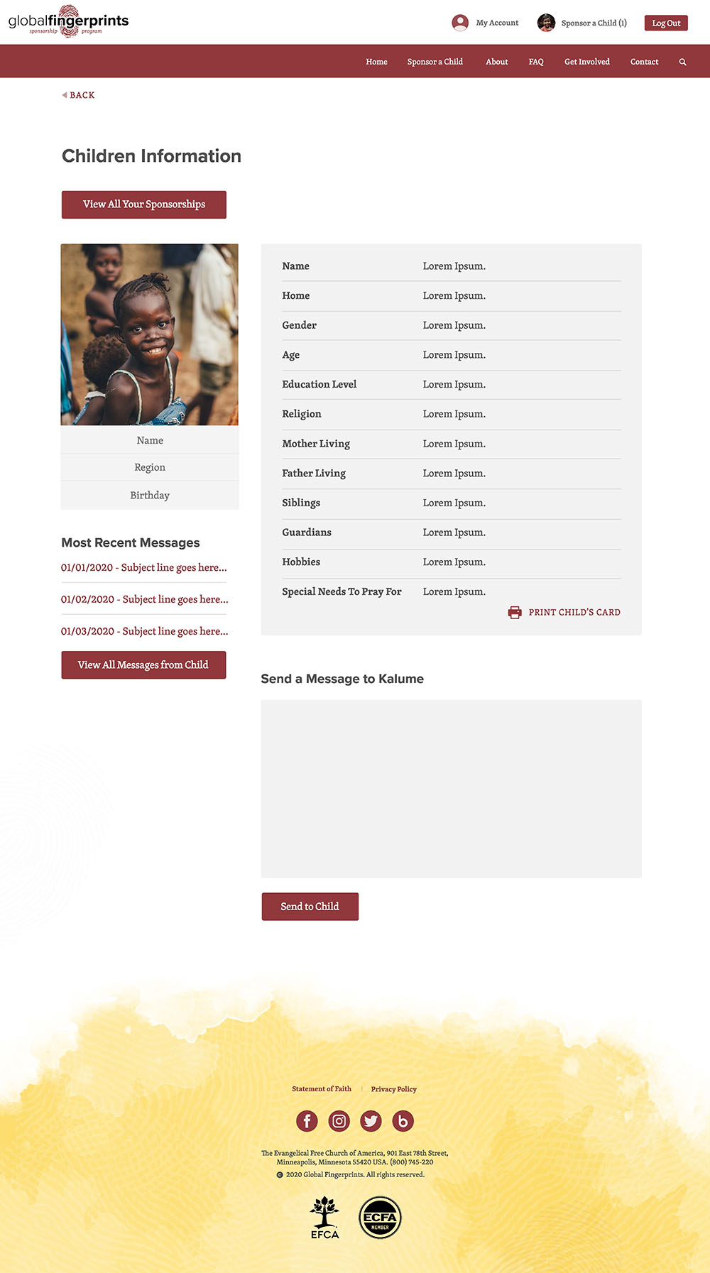
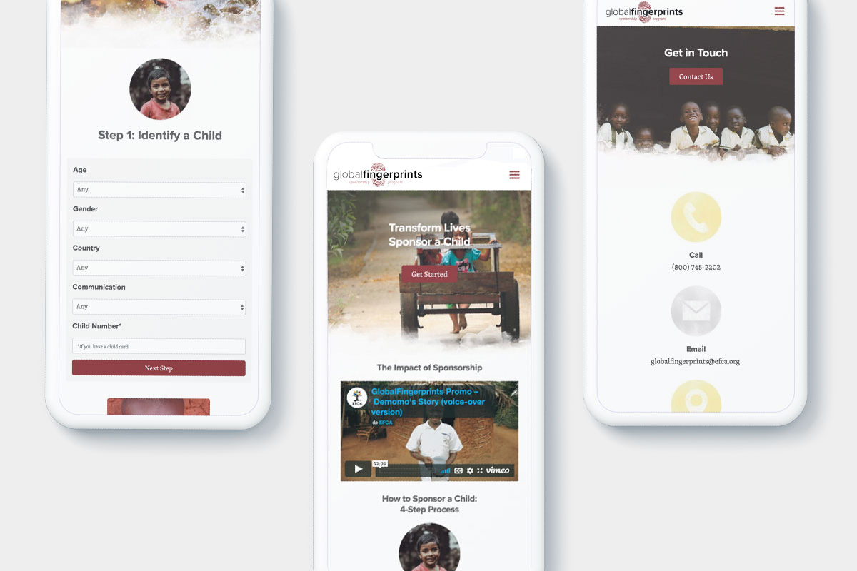
Adobe XD, Photoshop, and Illustrator were used to create the following high-fidelity designs.
DESIGN ELEMENTS AND STYLE GUIDE
Logo

(Previously designed by the GF organization)
Fonts

Colours
#90393b
#fcde6e
#505050
#f2f2f2
Iconography
![]()
Patterns

Fingerprint patterns inspired by the logo.

Watercolour patterns that go along with the positive and playful theme.
PRODUCTION AND LAUNCH
After I finished the high-fidelity mock-ups and handed in the design files, the Global Fingertips team took charge of developing and testing the new website. Some of the key takeaways of these projects were to learn to make the adoption flow easier for donors, while still maintaining a budget in mind. We were able to achieve these by keeping the design simple, standardizing components, and focusing on the messaging.
